You are using an out of date browser. It may not display this or other websites correctly.
You should upgrade or use an alternative browser.
You should upgrade or use an alternative browser.
QLTV's Graphics
- Thread starter QueenLucyTheValient
- Start date
QueenLucyTheValient
New member
Thanks! 
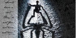
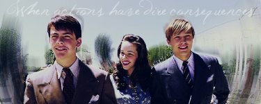
The Spider Man ones were not my favorite last batch... But I have some new ones that I really like. And I have one from BRAVE!!!
Im going to upload in two posts...
The Spider Man ones were not my favorite last batch... But I have some new ones that I really like.
And I have one from BRAVE!!! Im going to upload in two posts...
Attachments


QueenLucyTheValient
New member


ahyperdude
New member
Thanks!
The Spider Man ones were not my favorite last batch... But I have some new ones that I really like.
second post here...
Ah, these are really good!!!
1) The "Brave" one gets 10-10 for me! The font is a modern, yet fitting font, and was placed very well! All the orange is awesome
")
2) My next favorite is the "Secret" Spiderman one! Once again, 10-10.. I love it!
3) The second Spiderman one is not my favorite.. I like the coloring and effects, but I don't like how the words are stuck in there. The avatars are ok.. Other then that, it's nice.. 9-10
QueenLucyTheValient
New member
 so I made these in hopes that the banner wont be resized...
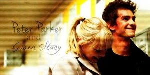


ahyperdude
New member
I LOVE IT!!! .. The style is amazing! My only problem is that the and seems a little off to the side (not centered with the rest) I'll ignore that though, because it isn't really a BAD thing. 10-10!!!
.. The style is amazing! My only problem is that the and seems a little off to the side (not centered with the rest) I'll ignore that though, because it isn't really a BAD thing. 10-10!!!QueenLucyTheValient
New member
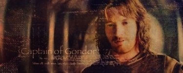
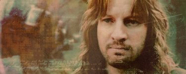
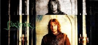
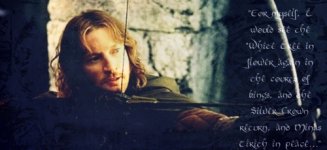
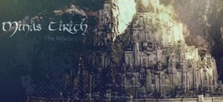
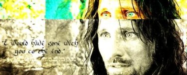
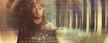
so here are some more. the Edmund ones are for the new contest, and the others are because i am in a huge LOTR mood after having a marathon with my stepsister.
Attachments


QueenLucyTheValient
New member


Zella
New member
so here are some more. the Edmund ones are for the new contest, and the others are because i am in a huge LOTR mood after having a marathon with my stepsister.
I LOVE the Faramir ones! Especially the last one. It's beautiful.
Lucy's maid
New member
wow! Those are all so cool and pretty! I really like the last two Faramir ones.
QueenLucyTheValient
New member
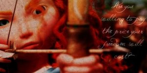
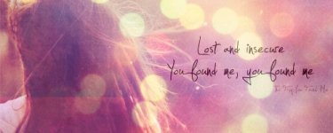
here are some more graphics.. I have an avatar for the Eowyn one but I was in a massive hurry to get off the other computer because my parents needed to get on it and they were getting really mad at me, so i accidentally posted the wrong avatar and have to wait till i can get back on tonight to post it... 
Attachments


Last edited:
ahyperdude
New member
YAY! lol, that's exactly what I think every time I see that you posted new graphics! These look SO beautiful
I'll rate them from least favorite to favorite:
http://www.narniafans.com/forum/attachment.php?attachmentid=11287&stc=1&d=1343452264
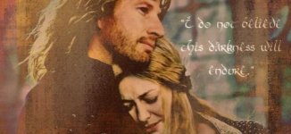
I give this one an 8-10. I like the picture, and I really like the effect you did, but the words are kind of hard to read, and I'm not a fan of the bottom font.
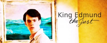
Next, the Edmund avi and siggie get an 8-10. Although I LOVE the vivid colors, I don't feel that the style matches the title "King Edmund the Just". Also, the "Just" lettering seems to be too thin in the avatar.
http://www.narniafans.com/forum/attachment.php?attachmentid=11295&stc=1&d=1343503989
This get's a 9-10 from me! I don't think the words are supposed to be readable, but they look REALLY good! I REALLY like the style of this one, and once again, I love that picture effect.
http://www.narniafans.com/forum/attachment.php?attachmentid=11288&stc=1&d=1343452273 (and the matching avatar) get a 9-10 from me. I LOVE the picture, and the words look great with it EXCEPT the placement. I feel like they should be centered between the top and bottom. The words are kind of hard to read.
http://www.narniafans.com/forum/attachment.php?attachmentid=11291&stc=1&d=1343452305
(and matching avi's) get's a 10-10! I LOVE the balance of calmness, and the words just MAKE it! I'm in love!
Anna also get's a 10. So beautiful and fun!
I'll rate them from least favorite to favorite:
http://www.narniafans.com/forum/attachment.php?attachmentid=11287&stc=1&d=1343452264
I give this one an 8-10. I like the picture, and I really like the effect you did, but the words are kind of hard to read, and I'm not a fan of the bottom font.
Next, the Edmund avi and siggie get an 8-10. Although I LOVE the vivid colors, I don't feel that the style matches the title "King Edmund the Just". Also, the "Just" lettering seems to be too thin in the avatar.
http://www.narniafans.com/forum/attachment.php?attachmentid=11295&stc=1&d=1343503989
This get's a 9-10 from me! I don't think the words are supposed to be readable, but they look REALLY good! I REALLY like the style of this one, and once again, I love that picture effect.
http://www.narniafans.com/forum/attachment.php?attachmentid=11288&stc=1&d=1343452273 (and the matching avatar) get a 9-10 from me. I LOVE the picture, and the words look great with it EXCEPT the placement. I feel like they should be centered between the top and bottom. The words are kind of hard to read.
http://www.narniafans.com/forum/attachment.php?attachmentid=11291&stc=1&d=1343452305
(and matching avi's) get's a 10-10! I LOVE the balance of calmness, and the words just MAKE it! I'm in love!
Anna also get's a 10. So beautiful and fun!
QueenLucyTheValient
New member


Ooooh! LotR graphics! I really like the Faramir ones, and the Eowyn one is neat. The colors look really nice. Though I do think it is rather odd to have her chin as the avatar. 
I really like the Faramir ones, and the Eowyn one is neat. The colors look really nice. Though I do think it is rather odd to have her chin as the avatar. ahyperdude
New member
10-10 for the banner! It's absolutely beautiful!
The avatars aren't perfect though.. so 9-10
The avatars aren't perfect though.. so 9-10
QueenLucyTheValient
New member
Thanks you guys!!
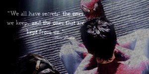
Here are some more graphics. some LOTR, some random, and some NArnia!! and some of them will be in the next post..
Here are some more graphics.
some LOTR, some random, and some NArnia!! and some of them will be in the next post.. Attachments


Last edited:
QueenLucyTheValient
New member
and here are the rest of the graphics.. the Narniarelated ones.
the Narniarelated ones. Attachments


ahyperdude
New member
YAY!!! More
(Favorite to least)
http://www.narniafans.com/forum/attachment.php?attachmentid=11340&stc=1&d=1344033670
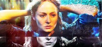
7-10, not digging the color scale at all on this one (on either section).. I feel like a warmer tone would be nice on this one, and the yellow just kind of throws me off. and I'm not sure I love that effect on this particular picture.
http://www.narniafans.com/forum/attachment.php?attachmentid=11346&stc=1&d=1344033880
Hmmmm.. I don't love the swirly things.. Just feels like a more amateur and tacky effect. The words are OK, but not placed perfectly. Everything else is nice 7-10
http://www.narniafans.com/forum/attachment.php?attachmentid=11350&stc=1&d=1344033972
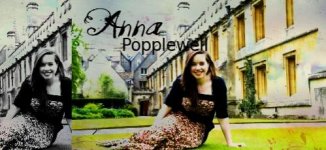
Georgie gets a 9-10.. (inspects thoroughly) Not sure what's throwing me a tad on this one.. I'm just not getting that PERFECT feel when I see it.. I think Georgie is a tad too transparent.. If she was more solid she'd jump out at you just a tad and I think that'd be better, but she kind of blends with the background. I LOVE the avatar!
http://www.narniafans.com/forum/attachment.php?attachmentid=11341&stc=1&d=1344033705
10-10. Absolutely BEAUTIFUL!
http://www.narniafans.com/forum/attachment.php?attachmentid=11343&stc=1&d=1344033750
Same for this one, perfectly beautiful! 10-10
(Favorite to least)
http://www.narniafans.com/forum/attachment.php?attachmentid=11340&stc=1&d=1344033670
7-10, not digging the color scale at all on this one (on either section).. I feel like a warmer tone would be nice on this one, and the yellow just kind of throws me off. and I'm not sure I love that effect on this particular picture.
http://www.narniafans.com/forum/attachment.php?attachmentid=11346&stc=1&d=1344033880
Hmmmm.. I don't love the swirly things.. Just feels like a more amateur and tacky effect. The words are OK, but not placed perfectly. Everything else is nice
7-10http://www.narniafans.com/forum/attachment.php?attachmentid=11350&stc=1&d=1344033972
Georgie gets a 9-10
.. (inspects thoroughly) Not sure what's throwing me a tad on this one.. I'm just not getting that PERFECT feel when I see it.. I think Georgie is a tad too transparent.. If she was more solid she'd jump out at you just a tad and I think that'd be better, but she kind of blends with the background. I LOVE the avatar! http://www.narniafans.com/forum/attachment.php?attachmentid=11341&stc=1&d=1344033705
10-10. Absolutely BEAUTIFUL!
http://www.narniafans.com/forum/attachment.php?attachmentid=11343&stc=1&d=1344033750
Same for this one, perfectly beautiful! 10-10