ahyperdude
New member
BEAUTIFUL!!!
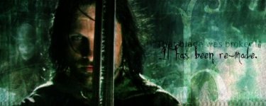
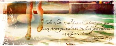
The LOTR ones automatically ALL get a 10-10! I LOVE them
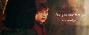
Georgie gets a 9-10")
The LOTR ones automatically ALL get a 10-10! I LOVE them
Georgie gets a 9-10
probably... 
Well, I have some more graphics for you guys...
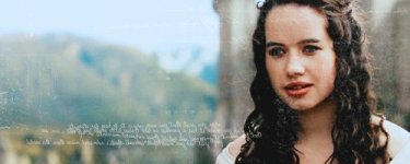
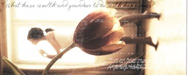
Especially the first one. But they are all beautiful. If you want it different feel free to tell me and I will gladly make another one... I may remake that one soon... I like the idea and stuff, but I dont know if It has the right look. I think a couple more textures would be perfect...  ... It just may be my favorite of yours! It captures the beauty and style of Susan perfectly! (or at least how I perceived her)
") there is Eragon and there is Aragorn. Aragorn and Eragon are two very different people. and about he banner, you can use it when I am done using it. My church goes camping with members of another church of the same denomination (OPC). It is a lot of fun, because both my best friends go, and we end up hanging out all day; and the views are beautiful. There is an old military fort nearby, as well as a couple bunkers, and it is right on the beach, so it is a marvelous view. So I didn't have my computer with me, and therefore didn't get on here because of this., that texture is perfect!
there is Eragon and there is Aragorn. Aragorn and Eragon are two very different people. and about he banner, you can use it when I am done using it. My church goes camping with members of another church of the same denomination (OPC). It is a lot of fun, because both my best friends go, and we end up hanging out all day; and the views are beautiful. There is an old military fort nearby, as well as a couple bunkers, and it is right on the beach, so it is a marvelous view. So I didn't have my computer with me, and therefore didn't get on here because of this., that texture is perfect! more graphics. thanks for the comments.
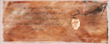
I agree, the one was empty, but I couldn't think of anything to say on it.
I made, what, four sets?
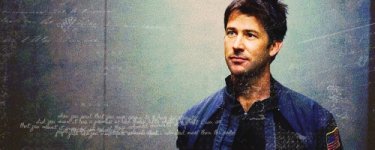
I like the quotes ones a lot, and I love the look of the backround on the Damian one, so I kept it dark, even though I don't like him that dark..
And the rest..
.. That's nothing to complain about though, and I think it's spotlessly perfect! 10-10. Anyway, this ones also perfect! 10-10! haha definitely going to use it.