You are using an out of date browser. It may not display this or other websites correctly.
You should upgrade or use an alternative browser.
You should upgrade or use an alternative browser.
QLTV's Graphics
- Thread starter QueenLucyTheValient
- Start date
ahyperdude
New member
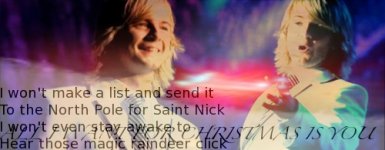
I like this one the most

and this one second

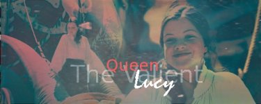
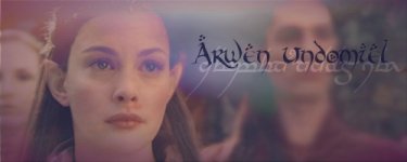
The red Lucy one doesn't match very well at all
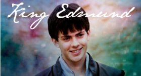
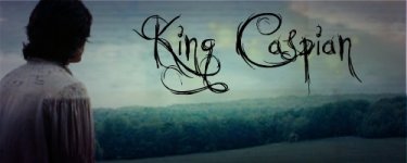
The King Edmund one is great!
I was wondering. What do you do with your graphics? Do you save all of them, or only the one's that you like? and do you save them at all?
and this one second
The red Lucy one doesn't match very well at all
The King Edmund one is great!
I was wondering. What do you do with your graphics? Do you save all of them, or only the one's that you like? and do you save them at all?
QueenLucyTheValient
New member
ahyperdude
New member
This is my favorite one!

I like this second (The text is a little crowded)
http://www.narniafans.com/forum/attachment.php?attachmentid=10037&stc=1&d=1323238670
The text is REALLY crowded on this one xD
http://www.narniafans.com/forum/attachment.php?attachmentid=10036&stc=1&d=1323238658
LOVE the colors overall
I like this second (The text is a little crowded)
http://www.narniafans.com/forum/attachment.php?attachmentid=10037&stc=1&d=1323238670
The text is REALLY crowded on this one xD
http://www.narniafans.com/forum/attachment.php?attachmentid=10036&stc=1&d=1323238658
LOVE the colors overall
QueenLucyTheValient
New member
THANKS ALL!!  Here are my latest banners. I finally checked out dafont.com, and LOVE IT!!!
  Man, there are some great fonts on there..
 ") But yea... My favorites are the last 3. I dont like the first one. the colors were not the best, in my opinion.
But yea... My favorites are the last 3. I dont like the first one. the colors were not the best, in my opinion.
Here are my latest banners. I finally checked out dafont.com, and LOVE IT!!! Man, there are some great fonts on there.. But yea... My favorites are the last 3. I dont like the first one. the colors were not the best, in my opinion.Attachments

ahyperdude
New member
I agree. From first to last these are my favs:
http://www.narniafans.com/forum/attachment.php?attachmentid=10109&stc=1&d=1324614513
LOVE THE COLORS
http://www.narniafans.com/forum/attachment.php?attachmentid=10108&stc=1&d=1324614494
just a tad on the dark side, almost making Caspian evil, but thats only if you look at it for a while
http://www.narniafans.com/forum/attachment.php?attachmentid=10107&stc=1&d=1324614467
this one is in the middle for me, nothen special about it if you compare it to the others
http://www.narniafans.com/forum/attachment.php?attachmentid=10106&stc=1&d=1324614451
The colors are off on this one like you said, and Edmund is making a weird face in the picture on the right. its not too bad though.
That was the hardest criticism I could give. So even though I complained, it was just about small stuff and I would be happy to use any of these as my banner! Thanks for sharing with us, they are all amazing! (I LOVE your style SO much! keep em coming!)
http://www.narniafans.com/forum/attachment.php?attachmentid=10109&stc=1&d=1324614513
LOVE THE COLORS
http://www.narniafans.com/forum/attachment.php?attachmentid=10108&stc=1&d=1324614494
just a tad on the dark side, almost making Caspian evil, but thats only if you look at it for a while
http://www.narniafans.com/forum/attachment.php?attachmentid=10107&stc=1&d=1324614467
this one is in the middle for me, nothen special about it if you compare it to the others
http://www.narniafans.com/forum/attachment.php?attachmentid=10106&stc=1&d=1324614451
The colors are off on this one like you said, and Edmund is making a weird face in the picture on the right
. its not too bad though.That was the hardest criticism I could give. So even though I complained, it was just about small stuff and I would be happy to use any of these as my banner! Thanks for sharing with us, they are all amazing! (I LOVE your style SO much! keep em coming!)
amdd97
New member
THANKS ALL!!
I love all of these, the font is awesome(one of my personal favorites!)
QueenLucyTheValient
New member
Thanks!Comments mean a lot to me, so keep 'em commin. ")
As for the comments, Hyper, I have to agree with ya, the first Ed one was a tad... wierd.. But the others were pretty good. My favorite was probably the fourth one. (And thanks, Annemarie, for telling me about the website a while back, dafonts.com. It is my new favorite website. heehee)
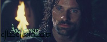
The first one, the Aragorn one, I didnt add any textures, just coloring and text and stuff. I am quite proud of it, considering how little i did on it.
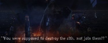
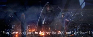
The Star Wars one was a request from my brother, a STAR WARS ADDICT (though not as bad as his best friend )
)
The other ones I love!! (Actually, i love all of them, but yea....)
As for the comments, Hyper, I have to agree with ya, the first Ed one was a tad... wierd.. But the others were pretty good. My favorite was probably the fourth one. (And thanks, Annemarie, for telling me about the website a while back, dafonts.com. It is my new favorite website.
heehee) The first one, the Aragorn one, I didnt add any textures, just coloring and text and stuff. I am quite proud of it, considering how little i did on it.
The Star Wars one was a request from my brother, a STAR WARS ADDICT (though not as bad as his best friend
)The other ones I love!! (Actually, i love all of them, but yea....)
Attachments
ahyperdude
New member
here are my thoughts. Going from my favorite to least favorite
OMYGOSH I LOVE THE ERAGORN ONE!
http://www.narniafans.com/forum/attachment.php?attachmentid=10110&stc=1&d=1324683139
The font/font colors are amazing and I love how you have it in two languages! (10-10)
http://www.narniafans.com/forum/attachment.php?attachmentid=10112&stc=1&d=1324683212
I LOVE IT! Great Quote/pic! Again great font/font color (10-10)
http://www.narniafans.com/forum/attachment.php?attachmentid=10111&stc=1&d=1324683160
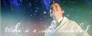
Wonderful colors! The snow makes it so magical, and the white text color is perfect! (10-10)
http://www.narniafans.com/forum/attachment.php?attachmentid=10113&stc=1&d=1324683247
I don't really care for this one, BECAUSE all I can see is black and font. I AM on a old laptop, so maybe its my screen, but I can't see much at all (5-10)
Thanks SO much for acknowledging my thoughts QLTV!
OMYGOSH I LOVE THE ERAGORN ONE!
http://www.narniafans.com/forum/attachment.php?attachmentid=10110&stc=1&d=1324683139
The font/font colors are amazing and I love how you have it in two languages! (10-10)
http://www.narniafans.com/forum/attachment.php?attachmentid=10112&stc=1&d=1324683212
I LOVE IT! Great Quote/pic! Again great font/font color (10-10)
http://www.narniafans.com/forum/attachment.php?attachmentid=10111&stc=1&d=1324683160
Wonderful colors! The snow makes it so magical, and the white text color is perfect! (10-10)
http://www.narniafans.com/forum/attachment.php?attachmentid=10113&stc=1&d=1324683247
I don't really care for this one, BECAUSE all I can see is black and font. I AM on a old laptop, so maybe its my screen, but I can't see much at all (5-10)
Thanks SO much for acknowledging my thoughts QLTV!
QueenLucyTheValient
New member
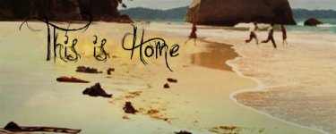
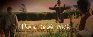
The Dont Look Back one is probably my favorite out of that batch as well, Anne.
The Star Wars one was definitely to dark. So I remade it, and both my brother and I think it looks way better than the other one. Tell me whatcha think on it.
Hyper, you spelled Aragorn's name wrong.
Here is another batch..
The Star Wars one was definitely to dark. So I remade it, and both my brother and I think it looks way better than the other one. Tell me whatcha think on it.
Hyper, you spelled Aragorn's name wrong.
Here is another batch..
Attachments


ahyperdude
New member
Damian won me out this time! This is my fav
http://www.narniafans.com/forum/attachment.php?attachmentid=10135&stc=1&d=1325054039
I finally decided that this is my second fav
http://www.narniafans.com/forum/attachment.php?attachmentid=10134&stc=1&d=1325054033
This next
http://www.narniafans.com/forum/attachment.php?attachmentid=10138&stc=1&d=1325054058
This
http://www.narniafans.com/forum/attachment.php?attachmentid=10136&stc=1&d=1325054045
and lastly this
http://www.narniafans.com/forum/attachment.php?attachmentid=10137&stc=1&d=1325054052
The first four are almost equal in rating for me! I love all of those. I really still don't care for the star wars one. Too crowded. I can actually see what it is now though
As always, great work!
QueenLucyTheValient
New member
Thanks you two!! Comments are loved, so keep commenting.
Okay, I think I may need to explain what the Star Wars one was all about.. My brother requested a Star Wars Banner with the Jedi Temple burning as the backround and Vader and the 501st clones faded on top, and then some words and he couldnt figure out which words.. So I remembered the quote currently on the banner and we decided that would be perfect. It was supposed to be kinda dark and depressing, and.... Well, its supposed to look the way it does. heehee
Well anyways.. Here are some more.. Sorry, Im in a really major Celtic Thunder mood, since I just saw the Sizzle Reel for the DVD of their new concert, VOYAGE, which I saw live in October, so I have been waiting forever for this.. (I think it was October..) The Wallie will be in the next post..
Okay, I think I may need to explain what the Star Wars one was all about.. My brother requested a Star Wars Banner with the Jedi Temple burning as the backround and Vader and the 501st clones faded on top, and then some words and he couldnt figure out which words.. So I remembered the quote currently on the banner and we decided that would be perfect. It was supposed to be kinda dark and depressing, and.... Well, its supposed to look the way it does.
heeheeWell anyways.. Here are some more.. Sorry, Im in a really major Celtic Thunder mood, since I just saw the Sizzle Reel for the DVD of their new concert, VOYAGE, which I saw live in October, so I have been waiting forever for this.. (I think it was October..)
The Wallie will be in the next post.. Attachments


QueenLucyTheValient
New member
ahyperdude
New member
YAY new graphics!
Here are my comments, in order of my my favs to least favs.
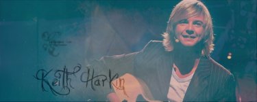
1. The "Celtic Thunder Storm" one is my favorite! Such a great idea! (the words) the font, words, colors, and picture are all perfect!
http://www.narniafans.com/forum/attachment.php?attachmentid=10155&stc=1&d=1325557307
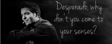
2. I don't know who this is, which would weaken my likes for it, but still, I REALLY like the feel of it! Great font/font color!
http://www.narniafans.com/forum/attachment.php?attachmentid=10157&stc=1&d=1325557324
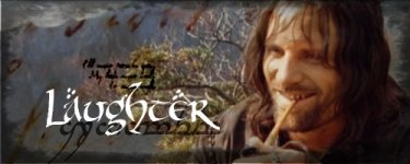
3. I like this one third BECAUSE he doesn't exactly seem to be laughing to me, more smiling. I liked the idea though and it was carried out greatly!
http://www.narniafans.com/forum/attachment.php?attachmentid=10154&stc=1&d=1325557300
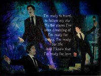
4. The Avie is my fourth fav. Hard to tell what it is though. Not loving it (like the rest) http://www.narniafans.com/forum/attachment.php?attachmentid=10156&stc=1&d=1325557313
5. and the wall-e is last. For some reason it seems too dramatic (with his arms spread out in each pic of him) I feel like he's gonna hug me lol. Anyhew it overall confuses me (I'm not trying to be harsh, just what it made me think of, its still definitely not bad, nor even weak. http://www.narniafans.com/forum/attachment.php?attachmentid=10158&stc=1&d=1325557500
Thanks for sharing! I specifically love the first three (that I commented on)
Here are my comments, in order of my my favs to least favs.
1. The "Celtic Thunder Storm" one is my favorite! Such a great idea! (the words) the font, words, colors, and picture are all perfect!
http://www.narniafans.com/forum/attachment.php?attachmentid=10155&stc=1&d=1325557307
2. I don't know who this is, which would weaken my likes for it, but still, I REALLY like the feel of it! Great font/font color!
http://www.narniafans.com/forum/attachment.php?attachmentid=10157&stc=1&d=1325557324
3. I like this one third BECAUSE he doesn't exactly seem to be laughing to me, more smiling. I liked the idea though and it was carried out greatly!
http://www.narniafans.com/forum/attachment.php?attachmentid=10154&stc=1&d=1325557300
4. The Avie is my fourth fav. Hard to tell what it is though. Not loving it (like the rest
) http://www.narniafans.com/forum/attachment.php?attachmentid=10156&stc=1&d=13255573135. and the wall-e is last. For some reason it seems too dramatic (with his arms spread out in each pic of him) I feel like he's gonna hug me lol. Anyhew it overall confuses me (I'm not trying to be harsh, just what it made me think of, its still definitely not bad, nor even weak. http://www.narniafans.com/forum/attachment.php?attachmentid=10158&stc=1&d=1325557500
Thanks for sharing! I specifically love the first three (that I commented on)