QLTV's Graphics

How do you like my graphics?

  • They are awful!! :(

    Votes: 0 0.0%

  • Total voters
    23
YAY New graphics :D

1) My favorite BY FAR is the "Emmet Cahill" one! I LOVE the background in comparison with Emmet! The black and white has SUCH a nice touch! :) That wins a perfect 10-10 on my scale!
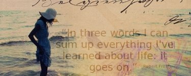
2) "Lazy Days" is my second favorite :).. 9-10

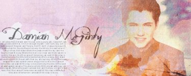
3) The "Damian" one is next! All of it is done well, just not perfectly, in my opinion. The pink, blue, and green seem to be a TAD overdone. 8-10

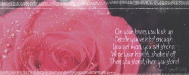
4) Is of course "Dance". GREAT picture, and great words for it, but the words are hard to read 8-10

Great work! :)
 
thanks, hyper.
here are some more graphics. :)

The banner/avatar couple are a request for a friend.
The two Damo ones that look identical are cause I couldnt decide which one i liked. :)
 

Attachments

  • damianbanner10.jpg
    damianbanner10.jpg
    75.6 KB · Views: 92
  • erinsrequestofStandbyRAscallFlattsrosebanner.jpg
    erinsrequestofStandbyRAscallFlattsrosebanner.jpg
    85.7 KB · Views: 90
  • erinsrequestavvie.jpg
    erinsrequestavvie.jpg
    5.6 KB · Views: 90
  • damianbanner12.jpg
    damianbanner12.jpg
    91.9 KB · Views: 93
  • damianbanner11.jpg
    damianbanner11.jpg
    83.2 KB · Views: 91
Last edited:
WOW, these are great! :D

1) This is my favorite! The style is amazing, and the text matches PERFECTLY with the colors and style! http://www.narniafans.com/forum/attachment.php?attachmentid=10612&stc=1&d=1334719247

2) This one is next, The contrasting colors (red and black roughly) are beautiful together! and the white text just MAKES it! http://www.narniafans.com/forum/attachment.php?attachmentid=10610&stc=1&d=1334718881

3) and of course the flower avi to go with it :) http://www.narniafans.com/forum/attachment.php?attachmentid=10611&stc=1&d=1334718887

4) Next, I REALLY like this one, it's not too crowded but feels just a tad dark, http://www.narniafans.com/forum/attachment.php?attachmentid=10607&stc=1&d=1334718856

5) By itself, this is amazing! But the words make it look 10X better!
http://www.narniafans.com/forum/attachment.php?attachmentid=10613&stc=1&d=1334719360

AMAZING WORK! I've saved my ratings until last because they are all the same rating for me.. And that is 10-10! These are perfection to me!
 
Thanks you all!!!!! :D :D Comments mean the world to me!! I love it when I get comments, so keep them coming, by all means. :)

as a reward, I have one more graphic.. (I would have had more, only I took to long trying to find new textures. :p)
 

Attachments

  • damianbanner13.jpg
    damianbanner13.jpg
    91.2 KB · Views: 66
I love the new one! :eek: You have lots of great stuff, but the banner currently in your signature takes my breath away! It's an awesome design, I love the colors, and you made great font/text choices!
 
10-10 for the new one! It looks great!

I need textures, how do you find yours?

Thanks!! I got some from the textures thread on here, I got some on another Narnia forum that I forgot the name of, I have got a lot of deviantart, and then google. (but I dont use google as much) Hope that was helpful. :)

I love the new one! :eek: You have lots of great stuff, but the banner currently in your signature takes my breath away! It's an awesome design, I love the colors, and you made great font/text choices!

Wow, thanks! :) I wasnt quite sure I was going to like it, but I did it anyways and I ended up loving it. I'm glad you like it so much. That makes my day. :D
 
sorry for doubleposting, but I have some new ones. :D

none of them are Celtic Thunder, (Unless you count using the lyrics to a song they do. :p) They are all stock photos I either got off of Pinterest or a site that RedRoses suggested, although I dislike a lot of photo's on that website and may not return to it.. :rolleyes:

But anyways, I love these new ones. Like, really love them. ;)
 

Attachments

  • sendmeasongbanner.jpg
    sendmeasongbanner.jpg
    78.5 KB · Views: 74
  • stealawaybanner.jpg
    stealawaybanner.jpg
    23.2 KB · Views: 50
  • whosaysyouarentbeautifulbanner.jpg
    whosaysyouarentbeautifulbanner.jpg
    74 KB · Views: 49
  • youareneveralonebanner.jpg
    youareneveralonebanner.jpg
    23.5 KB · Views: 50
sorry for doubleposting, but I have some new ones. :D

none of them are Celtic Thunder, (Unless you count using the lyrics to a song they do. :p) They are all stock photos I either got off of Pinterest or a site that RedRoses suggested, although I dislike a lot of photo's on that website and may not return to it.. :rolleyes:

But anyways, I love these new ones. Like, really love them. ;)

They're all beautiful! The first is my favorite.
 
Here are a couple more. I left my Ipod at my nana's so my inspiration isnt here... :(
 

Attachments

  • peterpevensievivalavidaquotebanner.jpg
    peterpevensievivalavidaquotebanner.jpg
    72.4 KB · Views: 62
  • lifegoesonbanner.jpg
    lifegoesonbanner.jpg
    91.9 KB · Views: 84
Thanks, Zella. :D

Here are a couple more graphics.. :p
dont know how much I like these ones... :rolleyes:
 

Attachments

  • cityscapebelieveinsomethingbanner.jpg
    cityscapebelieveinsomethingbanner.jpg
    79.9 KB · Views: 56
  • lovestorybanner.jpg
    lovestorybanner.jpg
    87.7 KB · Views: 56
  • simplethingsbanner.jpg
    simplethingsbanner.jpg
    72.2 KB · Views: 58
I have some new ones. :D

You don't know how good it feels to get onto here, and see PERFECT graphics! That's exactly what almost all of yours are!

For the first one, (You are never alone) I give a 8-10. I like the picture and the words, I just don't love the clock :p.. The color scale feels a little off

Next, (The "Beautiful" one) I give it a 9-10! Pretty much perfect! It confuses my eyes a tad about WHO is the beautiful one, because I only see a tree. The focal point isn't spot on.

The "Chase our Dreams" one feels a tad low quality, but other then that, carried out very nicely! I love the text color in contrast with the redish color of the rest of the picture! 9-10

The "Send me a song" words, don't seem to match with the picture. Other then the words not matching, I love everything else! 9-10

The Robert Frost one earns a 10! :D

Then latest (past what I've rated already) all get a 10! I especially love the "Simple Things" one

All of these are so beautiful! :D
 
You don't know how good it feels to get onto here, and see PERFECT graphics! That's exactly what almost all of yours are!

For the first one, (You are never alone) I give a 8-10. I like the picture and the words, I just don't love the clock.. The color scale feels a little off

Next, (The "Beautiful" one) I give it a 9-10! Pretty much perfect! It confuses my eyes a tad about WHO is the beautiful one, because I only see a tree. The focal point isn't spot on.

The "Chase our Dreams" one feels a tad low quality, but other then that, carried out very nicely! I love the text color in contrast with the redish color of the rest of the picture! 9-10

The "Send me a song" words, don't seem to match with the picture. Other then the words not matching, I love everything else! 9-10

The Robert Frost one earns a 10!

Then latest (past what I've rated already) all get a 10! I especially love the "Simple Things" one

All of these are so beautiful!

Lol, on the 'beautiful' one, if you look, there is a girl in there... :p lol

On the 'Steal Away' one, the pic isn't low quality. I think its what textures I used and what effects I used....

Thanks for your comments!


If you know the song, the picture is perfect.;)

Lol, thanks, Zella. :D

Hyper, this is the song. Listen to it. Then you will understand why I chose those words for that banner. ;)
http://www.youtube.com/watch?v=rh-q8RNLr3Q
 
Thanks all!! :D I have some new ones. Both are Harry Potter (more specifically, Draco Malfoy) related. :)

By the way, the difference between the two near identical ones is text. I have text on one, and the same text is gone on the other, because I could not decide which one I liked better... :p
 

Attachments

  • dracobanner2.jpg
    dracobanner2.jpg
    76.9 KB · Views: 41
  • dracomalfoybanner1.jpg
    dracomalfoybanner1.jpg
    58.8 KB · Views: 43
  • dracobanner2(2).jpg
    dracobanner2(2).jpg
    75.2 KB · Views: 43
  • dracomalfoybanner3.jpg
    dracomalfoybanner3.jpg
    67.5 KB · Views: 44
Last edited:
Alrighty, glad to see some new ones!

1) (First Drake Malfoy posted) Amazing! I feel like the focus is a little off. I want to be able to READ the words, and see drake. Of course, the more dominant parts of the graphic are AMAZING! I love the insignia. 9-10

2) (The Dementors one) I love it! Sarcasm :D that gets a 10-10 for me! The colors are SO perfect!

3) (The Second Drake one) Pretty much the same as my first comments.. I really don't have a preference between the added words. 9-10

4) (The last Drake one) AMAZING! I love the brightness of his hair and the words in contrast with the background!!! 10-10! I think this is my favorite out of all of them!
 
Back
Top