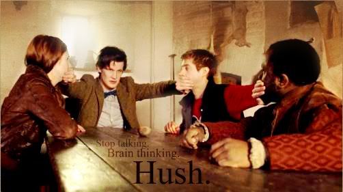
'A Very Important Thing To Do' is great. That scene is hilarious. xD I like the text placement better in the second one (including the size of the two lines of text), which leads me to call it my favorite of the two, but I like the brown font color better in the first. If you simply colored the text in the second brown, it'd be ideal.
The Doctor Pooh ones just aren't working for me. =/ The concept is great, so I think it's the space texture. Space and Pooh just don't mesh well. xP As for text, I like the
first one better. I think the 'Trust Me' banner's text would be improved by straightening it so it looks like the former. The second 'Doctor Pooh' text could be improved by making 'Pooh' bigger than 'Doctor'. In the first one it works because of the text placement, but in this one, as it is, the text looks top-heavy.
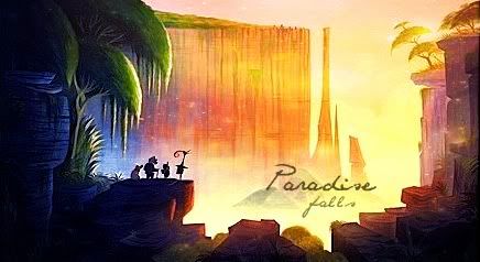
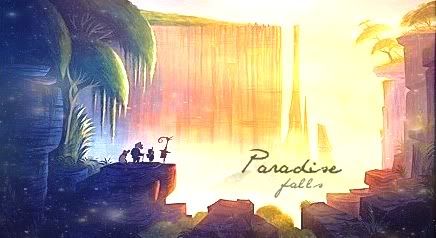
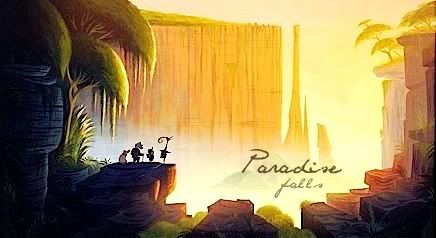
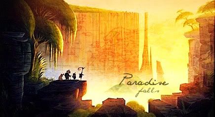
Both 'The Pathway' banners are wonderful. I like the first one better; I love the clarity of the banner. The concept itself lends its charm to the graphic and it makes you want to sink back in the warm comfort of memories of childhood and the imagination and mystical wonder therein.
I like the idea of using a texture on this banner, particularly because it makes the text stand out and gives the banner an aged, distant-memories feel, but I have a slight problem with the particular texture you chose. I know that you are limited in your textures and, knowing that you strive for excellence, I'm believe this was the best you could find. And it does give the distant-memories sort of feel to the graphic. The main thing that throws me off is the color, particularly on the edge. It looks kind of icky. If it was a little more brown or a little more green or maybe more red or yellow, it might work, but with the combination of colors as it is now, it irks me.

You might want to try overlaying (not saying that you have to use that mode, just for ease of critiquing, I'm going with that) the same texture again, so you've got two or three layers of the same thing. Fiddle with the modes and fade the textures in and out until you get to whatever you like, or an improvement, or you get tired of experimenting.

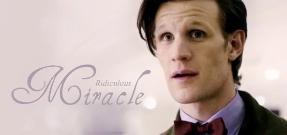
'Wonder' is wonderful. :3 I wuvs it.
(One thing: you, of all people, used a comma where it doesn't belong!  )
)
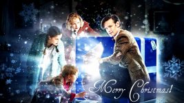
I just made myself a new banner. A long time ago, I had a similar one. I wanted to use it again, but thought I could do better now, so I remade it. I also sort of remade that Pascal avvie I had for so long.
Uwah! I love it! The original was great, but this new one is
fantastic! XD
(And yes, I'm saying that in a Ninth Doctor voice. *nod*) The fonts and the text placement are perfect.
As for critique, I might make the TNR text a little bit bigger so as to be more readable and to look a tad more balanced but that might overwhelm the picture, so it would be something to experiment with.
 I like it better than the old one. I like the font and the colors.
  And the other stuff is great too, BTW.
  You do great stuff! Sorry I dont comment more. I haunt the threads, but I dont comment much on anything anymore.
  All your graphics are amazing. The Winnie the Pooh ones from a few pages back are great!
