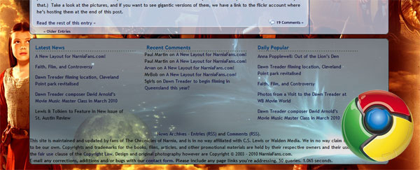
If you’re viewing the website in a browser, and not on an RSS feed, then you’ll notice that things have changed. Pretty drastically. I have been working on this new layout for a very long time. It’s been something that I’ve been rolling around in my head for the better part of about 3 years now, and over the last couple of weeks I spent countless hours bringing my imagination to life.
It’s not all the way there, yet, but I’m going to continue to tweak it until it’s perfect. I’ve created a layout that allows for more content, easier navigation, and easier redesigns in the future. The background will change pretty regularly over the course of the year, as more Dawn Treader photography is released.
One thing that you might notice if you use more than one browser, is that it actually looks better in Firefox and Google Chrome than it does in Internet Explorer. However, if you’re not using Firefox or Chrome, you’re missing out on the optimal version of the website, period.
Either way, I think switching from a Prince Caspian layout to this new, transitional layout is an important step in bringing more awareness to the fact that the Voyage of the Dawn Treader is coming this year.
I hope that you enjoy it. If you have any suggestions, feel free to comment below. Constructive criticism only, though. If it’s not constructive, it’s deleted.
Down at the bottom of the screen you might notice a new toolbar. It doesn’t seem to show up in Internet Explorer 8, though. It’s our new meebo bar. It allows for easy drag and drop sharing of our stories and pages. When you move your mouse over pictures from, from time to time you’ll notice a “drag to share” link appear. Just click and hold, and then drag the item to the option of your choice. You can also very quickly share with the link on the left side of the bar.
Also new are the share links you can see in a group. The first is “ShareThis” which we’ve had since it first went public. The other two are the most popular services for sharing: a retweet button to quickly twitter the story, and a facebook button to quickly post the story to your wall!


AWESOME!!! I love it! But is there still a way to view the old one?
Thanks tons! Sorry, there is not at the moment. Plus, I made some major changes to the pages within the site, and the older layout would appear extremely broken on some of them.
Interesting new layout. If I may make a suggestion, the links on the top banner for the forum, books, etc. is a bit hard to see. black on dark green is not the best. I would suggest lightening either the words or the banner.
Other than that, it’s pretty good. Thank you.
MrBob
Thanks, MrBob! I thought so too. I’ve changed it to a color to match the background of the news. Hopefully it works. I think it’ll get nicer looking as time goes on.
I love this, but I think it would be good to put more focus on Aslan somehow.
Well, Aslan is on the right and on the left, how could I put more focus on him?
I suppose you could have him trade places with Susan. It looks like we’re putting her right up on top, one of the first things people see. Also, would you mind telling me what sort of code you use to make the article area scroll but not the background?
I see what you mean. When I was putting it together, I intentionally put Aslan on the edges, however, so that he’s always present, even when you scroll. But I’ll take that under consideration, regarding Susan being one of the first that you see. I’m planning on changing the background on a frequent basis. Probably monthly. If a fan sends in one that is incredible, I might consider using it for a short time as well.
As for how I did that, it was done with CSS. This is the entire CSS code that made it happen.
body { background: #346a65 url(‘images/nfc2010bg.jpg’) fixed no-repeat;
background-position:top center;
}
good new layout 🙂 way to go 🙂
Thanks, Michelle! I appreciate it!
The new layout is absolutely amazing! The only problem I have it the coloring of the Narniafans.com logo & the news background, I think that a tan/brownish background coloring would work better for it. HOWEVER, it looks awesome!
I’ll keep that in consideration. Personally, I didn’t want it to look too much like another Narnia website. I should probably put up the other variation of the background that I made. It’s mostly blue-green and goes really well with the news. I’m going with this color because I wanted familiarity in people’s minds.
It gives me a headache with the see-thru windows.
You think I should make them less transparent?
I really like this new layout! Much better than the original one and it brings the spirit of Narnia to the website – if you know what I mean!
No critique–just pleasure.
Well… it did take me a moment to spot the links, but that’s me, not you. And it looks a lot more vivid and shiny, and I love the parchment texture on the left edge!
Somehow I’ve always felt like bright, sunny gold is a Narnian color. 🙂
Me too. The color seems to match Aslan’s fur, which is great. But that makes sense!
Love the new layout. I really like the sun in the conner shinning up everything. but the countdown doesn’t appear to be working like it used to. It’s not moving.
Thanks, yeah… the sun is from an actual photograph, which adds to the realism of it.
Amazing redesign! I love it! And it is perfect for using with different backgrounds–I’m sure some will look better than others, but the concept and basic layout are brilliant no matter!
Thanks! I’m considering putting the blue variation up soon, but I’m not sure.
I hope this isn’t nagging, with all the effort that must’ve gone into the beautiful new layout, but do you have any idea when the Fan Section will be updating again?
This isn’t nagging. It’s going to be updating soon. I spent a lot of time on this, and want to get that updated, as I have a back-log of things to put up. I still have things to work out with regard to how it’s all going to work, and I want to re-design the whole thing, but now that I’ve got the design into a condition that is nearly what I want, I have a lot of data to add.
this looks great Paul! congratulations!
Awesome work, Paul! I’m using Chrome and it is wonderful. The only thing I don’t see is the meebo toolbar you were talking about. Keep up the great work!
I use Google Chrome and am glad of it, for the layout looks absolutely stunning!!
Good job. I like it. And again thanks for keeping us Narniafans informed.
I totally love it!
Really awesome!!! I just wish you could see Edmund a bit more clearly, but whatever 😉 really stunning!
I’m using Internet Explorer, and this still looks great! There’s only one thing, and it’s not a big deal… I find the font used for the comments is a little hard to read. Maybe changing it or making it larger might help… Still, this is amazing. Congratulations on your hard work paying off.
Oh, and I’m glad you didn’t take any off the lists of latest news, recent comments, and daily popular from the bottom of the page. I use those links all the time. 🙂
I’ll see what I can do about the font. I’m just trying this one temporarily. I’ll see if I want to keep it, and I might just make it larger as well.
I love the layout!! It’s epic–in a good way 😉
Very nice work, I can tell you put a lot of time into it.
Wow! This makes it look like a whole new site! I love it! Though I’m wondering why Susan and Peter are in the picture. Are they going to be on the voyage too? Very epic! I keep hearing about Google Chrome, and now I’m wondering if I should download it and try it out…should I?
Peter and Susan are in the picture because I used cast photos from Prince Caspian. Also, because they are beloved characters from the series thus far.
Regarding web browsers: Use Mozilla Firefox for the extensions and add-ons. There are awesome tools that you can add to your browser to make it really rock! Use Google Chrome for the speed. Trust me on this: Once you try Chrome, you’ll wonder why you ever used Internet Explorer. Chrome is really really fast. You’ll notice that websites just seem to load much quicker on it.
wow!! love everything!! at first i thought my bookmarked page was all messed up!!! it looks wonderful! i agree with whoever said about susan on top, but everything else looks absolutely awesome!!! colors! pictures! layout! love it! i especially like the picture from VDT on the right!! thank you paul!!!!!
Wow I love it!
Love the background…you make it yourself???
Amazing footer on chrome and firefox
(stupid internet explorer…lol)
Yes I did. 🙂
WOW! I went to this page and gasped! It looks great! To bad you can’t see Edmund and lucy very well… It’s really stunning!I like how you said that was a picture of the real sun!
love it! great design! 🙂
As a Firefox user gotta say I love the new layout. Great job, Paul.
Good job on the re-design of the website. It gets me excited to see “Voyage of the Dawn Treader” this year. I cannot believe it is now THIS year and not some other year. I am hoping to see some cool interviews and more surprises as we get closer …
WOW was my first thought when I opened this side:D I love the background, but I miss one thing: where’s the picture of Lucy standing aft the Dawn Treader from VDT? I liked that one so much, it should be here since the movie is coming up…
I tried to get that picture into it, but in the end, I couldn’t make it work.
I like your background image. I hope you keep a folder of all your previous background images, so we might visit them again. Good work. I agree about Peter and Susan; they always have a place in Narnia. They are high king and queen. Even if Susan does lose faith she is still high queen. Once a king or queen of Narnia; always a king or queen of Narnia.
Wow, it really does look magnificent! Only a few problems from me…
Susan. She is like RIGHT THERE. Know what I mean?
Aslan is kind of hidden. I think he should be more of a focus.
Not sure if I like them floating in the clouds, but it’s ok.
I LOVE the colors you have put through it all, it really is Narnian! I also like the layout transparent, so I can see a few of the characters here and there. :)It really is excellent!
This is so cool! I totally love the new layout! It is so awesome!
Thank you. It looks muich better now.
MrBob
Good job on the new layout. It looks awesome!
I love the new layout. It’s amazing. 🙂
Well with due respect the owner of this forum i have an idea.
I am one of the biggest fan of this series and i really dont want it to be stopped after the 7th novel. I have a wonderful story no. 8 to write with prior permission of the authority. I would be glad to receive a reply mail on my email address. If the reply reaches i will tell you the idea. Please dont under estimate and please please please please reply me if this thing attracting you
Thanks a lot
Kamran
Looks great, Paul! I love the way it all looks, especially being able to see the background. I also like how the replies to the comments have the lamp post in the corner! Totally awesome and very Narnian!
I like the new look of the site. It’s much easier to read. I love the back ground photo. It would be great if this site had a photo gallery with tumb nail Narnia pictures that you could ckick to easily find the Narnia pictures you want to look at. Thank you for a great site.
Thanks, Bobby! I’m going to be adding that soon as well. It’s been a plan of mine for quite some time now. I’ve been holding out for WordPress to build it in as part of their program. They’re supposed to be adding a “Media Gallery” to the functionality that would allow me to categorize all of my uploaded media into albums that people can go through. I’d rather wait for them to do that, than install another resource hogging image gallery software.