Hi Rainshadow. I decided to visit your thread and I see a lot of potential in your graphics!
Two things I really like about your graphics are first, that you use high-quality pictures and second, your graphics have some really good effects done on them.
As a fellow graphic designer, I'd like to offer you some advice; feel free to completely ignore it:
1) With your word placement try not to put words over the main focal point; Instead put it in an open and contrasting area of the image. This graphic for example:
http://i1352.photobucket.com/albums/q656/MoonfishParachutist/AdamYoung2_zpsa99c962d.jpg Has really good placement in the top middle, but the words below just don't fit in. Either take them out, or completely take one of the Adams out, and put the words in his place (here's an example:
http://www.narniafans.com/forum/attachment.php?attachmentid=11285&stc=1&d=1343330167)
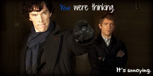
2) Try changing up the font a bit. In most of your graphics you have a basic italicized text. Think of commercial graphics though: They often use custom fonts. (Example:
http://www.narniafans.com/forum/attachment.php?attachmentid=11151&stc=1&d=1341707436) You can find some really amazing fonts at this website:
http://www.dafont.com/
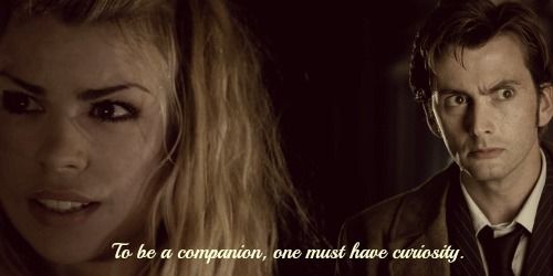
3) Try not using too vivid text colors. Orange was the color I always used to use, but it looks really unprofessional and takes the quality away from a picture. Instead, try picking a color that is close to a prominent or contrasting color in your picture (example:
http://www.narniafans.com/forum/picture.php?albumid=638&pictureid=10493) In this picture:
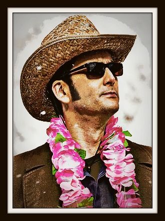
http://i1352.photobucket.com/albums/q656/MoonfishParachutist/AdamYoung3_zpsbd99699f.jpg maybe a red (like the red in his tie) would make a really good text color?
I really hope you take my advice. I see a lot of potential in what you've made so far, and I really want you to get better. I'm in no way trying to judge your graphics and, from my experience, am simply adding my advice.
Good luck in your future graphics!


")


")
 )
)