The Last Picture Show

Tales of Wonder

BK, that cloudy one is intensely amazing! :D i like the little dragons

BK you have to be one of the most talented photoshopping artists ever! I CANNOT BELIEVE how real it looks, even with the clouds dubbed in! 10-10!

Oh my goodness! :eek: The two new ones are amazing!
Thank you for the compliments.

Here is the last one, I hope you all like it. This is the first one on what I hope will become my "Tales" series. Let me know what you think.
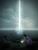
 
I LOVE this one! My one and only complaint is that the light the girl is holding looks a little out of place.. It feels like you got a sparkle tool in paintshop and just clicked there.

Other then that, I love it! I especially love the dragon, and the curiosity of it all!

9.5-10.. On the edge of perfect ;)
 
Free

This going to be my last one for a while. I have plans to do more Doctor Who sometime soon.

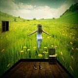
Wouldn't you like to have a room like this? Enjoy.

 
Oh, I love it! It's such a neat creative interpretation, and it's beautiful! :eek: Even though I cannot see what the images you started with looked like, I know that your photoshop work was very impressive. ;)
 
Thanks! Here's a LINK to the original photo of the field. You can see how I had to change it to make it look like a square room. This technique I think was developed (or at least refined) by Michael Vincent Manalo, the Filipino artist from whom I've learned photoshop techniques. This particular one involved cropping the image at exact measurements, transforming each piece of the image and reassembling precisely at the cropped edges to avoid showing a "line" where the reassembling took place. If you observe closely, you'll notice that I did use slightly different sky than the one on the original image.
 
Last edited:
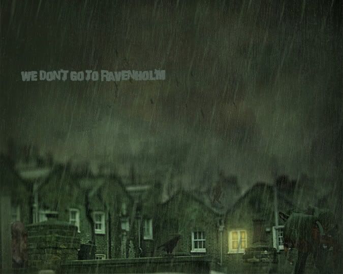
We Don't Go To Ravenholm

This one is a bit different from what I usually do but I just came up with the idea. This one is based off of a chapter in another of my favorite video games: Half Life 2.

Ah! The crazy town of Ravenholm. Why u no play this game?

WeDontGotoRavenholm-1.jpg
 
Last edited:
The Salvage of a Lifetime!

Its been a whiiiiiiille!

I've had the idea of making this for a while, ever since I watched the episode Journey to The Centre of The Tardis. I think Jenna-Louise (Clara) was brilliant and she looks very pretty in this episode. I don't think the graphic is pretty good because I haven't made one in a long time and I'm out of practice. But hey, here it is.


The trailer for that episode is at this link: http://www.youtube.com/watch?v=fRb1N2eEs1I

If the full episode is still available, it's here: http://www.youtube.com/watch?v=rza0dLrRG9s
 
Last edited:
Flickr

Flickr and keeping the thread alive!

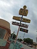
Since most of my photos in Photobucket are Private, I started an account on Flickr for the photos I want to make public. I started by taking pictures of the signs of these motels along Long Beach Boulevard in So. Cal. Funny thing they still have the old RCA "Color TV" sign from way back when. The one I'm sharing here even has the word "well" mispelled! :eek: For a few more pictures, visit my Flickr account. I will be posting more soon as there are more motels in that area with the same RCA sign.

My Flickr account!

 
Cool photos! This one is not an old motel sign, but it looks like Texas through my windshield. Hope you like it. Sorry it is so big! Don't know how to fix it!
 

Attachments

  • texas-america.jpg
    texas-america.jpg
    85.8 KB · Views: 72
Nice Inky. Like the signs.

And just in case anyone is wondering, my pictures are not THAT small. They are just thumbnails. You have to click on them to see the full size image. Just thought I'll throw that in since someone asked me. :)
 
Oh wow, that's gorgeous! Is that your daughter? (I think you have a daughter, right?)

beautiful work.
 
Back
Top