You are using an out of date browser. It may not display this or other websites correctly.
You should upgrade or use an alternative browser.
You should upgrade or use an alternative browser.
Yet ANOTHER graphics thread
- Thread starter MissReepicheep
- Start date
Celebrilomiel
New member
Made anything new lately?
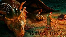
No, but I do have some VDT graphics which I failed to load when they were newer. Of these, the "Unlikely Friends" one is my favorite. 
Attachments


ahyperdude
New member
Omg love allll of these!!!!!!
Celebrilomiel
New member
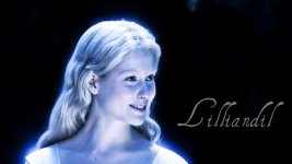
I like 'Unlikely Friends', but I think my favorite is Reep's 'The Utter East'. The font and color is perfect.
HighKingPeterMagnificent
New member
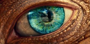
I think my favourite is the eye one, but they are all great!
Lucy's maid
New member
Those are all so pretty!! I really like all of them.
Red Roses
New member
I like 'Unlikely Friends', but I think my favorite is Reep's 'The Utter East'. The font and color is perfect.
Those are my two favorites too.
Keep up the great work, MissR!
No, but I do have some VDT graphics which I failed to load when they were newer. Of these, the "Unlikely Friends" one is my favorite.
They're all gorgeous, they're great quality pictures. But yeah, I really love the Unlikely Friends one.
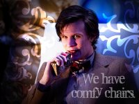
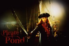
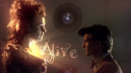
You all knew it was coming... Doctor Who graphics! ^_^
I think the stickers on the first one look cool, but I'm not convinced that they actually fit the photo.") Thoughts?
Thoughts?
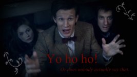
I really like the second graphic...
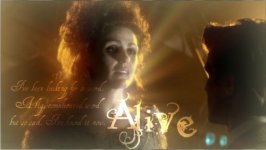
Not fond at all of the third, although I have no idea why.
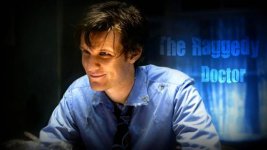
HIS FACE IS BLUE in the fourth one!! I tried editing out the color, but then his face was vibrant purple, and I decided that was worse. Oh well.
I think the stickers on the first one look cool, but I'm not convinced that they actually fit the photo.
Thoughts?I really like the second graphic...
Not fond at all of the third, although I have no idea why.
HIS FACE IS BLUE in the fourth one!! I tried editing out the color, but then his face was vibrant purple, and I decided that was worse. Oh well.
Attachments
Last edited:
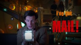
And more...
The font kinda annoys me in the first graphic, but it was the best of the options I had. I wanted the text to be bigger, too, but then the color was inconsistent or the text was on the Doctor's face.
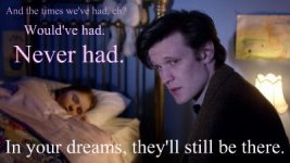
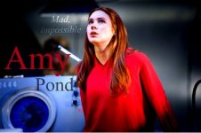
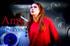
Which Amy one looks better? The one with or without the stickers? I vacillated between the two and decided to post both. xD I think I like the one with stickers better, but as soon as I say that, the other one seems more appealing...
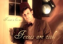
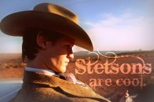
I am very fond of the stetson one. They ARE cool, and I find it depressing that River shot it. xP That kind of treatment should be reserved for fezzes only!
The last graphic is just a random one which I made out of a screenshot of the night sky from VDT.
The font kinda annoys me in the first graphic, but it was the best of the options I had. I wanted the text to be bigger, too, but then the color was inconsistent or the text was on the Doctor's face.
Which Amy one looks better? The one with or without the stickers? I vacillated between the two and decided to post both. xD I think I like the one with stickers better, but as soon as I say that, the other one seems more appealing...
I am very fond of the stetson one.
They ARE cool, and I find it depressing that River shot it. xP That kind of treatment should be reserved for fezzes only!The last graphic is just a random one which I made out of a screenshot of the night sky from VDT.
Attachments

ahyperdude
New member
You all knew it was coming... Doctor Who graphics! ^_^
I think the stickers on the first one look cool, but I'm not convinced that they actually fit the photo.
I really like the second graphic...
Not fond at all of the third, although I have no idea why.
HIS FACE IS BLUE in the fourth one!! I tried editing out the color, but then his face was vibrant purple, and I decided that was worse. Oh well.
And more...
The font kinda annoys me in the first graphic, but it was the best of the options I had. I wanted the text to be bigger, too, but then the color was inconsistent or the text was on the Doctor's face.
Which Amy one looks better? The one with or without the stickers? I vacillated between the two and decided to post both. xD I think I like the one with stickers better, but as soon as I say that, the other one seems more appealing...
I am very fond of the stetson one.
The last graphic is just a random one which I made out of a screenshot of the night sky from VDT.
I like them all! (especially for not being a doctor who fan!) even the ones you don't like I still love! Excellent job AND the fonts are AMAZING and the lighting goes perfect with EVERYTHING!!! and finally I like the Amy Pond one better WITH the stickers!
very nice, D. I think I like the second Amy one better. I like the swirly thing
Iriadoriel
New member
Hehe. Doctor Who just makes me happy all over. ")
Yay, we've converted you!Hehe. Doctor Who just makes me happy all over.
(Not that I really deserve credit...  )
)Right now, I am ECSTATIC!!! Picnik added new SPACE textures!!! *obsesses* I'll load some graphics I make with those soon. ^.^ For now, here are some more Doctor Who ones.
Attachments

I AM IN LOVE with the new textures! 
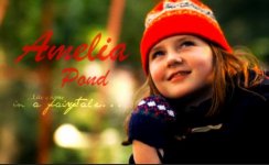
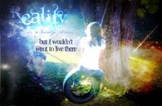
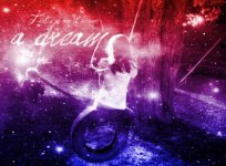
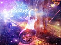
The first graphic is one I made a few days ago. The others were made with the new textures. The base photo is a picture I took of my cousin last fall.
The first graphic is one I made a few days ago. The others were made with the new textures. The base photo is a picture I took of my cousin last fall.
Attachments


QueenLucyTheValient
New member
those are great, MissR!!!!!! I love the ones with the textures! They are amazing!!
I love the ones with the textures! They are amazing!!