Yet ANOTHER graphics thread

What do you think of my graphics?

  • They're great!

    Votes: 32 88.9%
  • They're okay.

    Votes: 2 5.6%
  • You'll get better over time- don't worry.

    Votes: 2 5.6%
  • I don't like them that much.

    Votes: 0 0.0%
  • Your graphics are terrible!

    Votes: 0 0.0%

  • Total voters
    36
Oh YaaaaaaaaaaaaaaaaaaaaaaaaaaaaaaaaaaaaaaaaaaaaaaaaaaaaaaaaY! :D I love it, the first one is my favorite, now Ralph will have a new background. :p
I'm glad you like it, GG dear! :D

BK, thanks for the advice! I may change my mind, but for now I think I'm done with this graphic. I certainly could improve it, but since I'm doing it on paint, it's really tedious and I don't feel that it's worth it to start over again. I'm content with this but will definitely keep in mind your advice for future wallpapers which I make. Thanks for the constructive criticism!
 
*Blinks* Paint?

....


That's oficially the best graphic I've ever seen made with paint.
 
*Blinks* Paint?

....


That's oficially the best graphic I've ever seen made with paint.
Well... It wasn't entirely done on paint. The sticker I added on picnik, and I also did the text there. The photo-positioning was all pasted into paint, though.
 
My sister uses GIMP. I use picnik for everything. I want to eventually get GIMP, but when I experimented with it on my another computer where it was downloaded, I was really overwhelmed and confused. Eventually, I'm going to download it and my sister will show me how to use it, but picnik is good enough for now so we haven't gotten around to it.
 
I made this with Adobe Photoshop CS4 for use on another forum I frequent:
SuperLink.png
 
My sister uses GIMP. I use picnik for everything. I want to eventually get GIMP, but when I experimented with it on my another computer where it was downloaded, I was really overwhelmed and confused. Eventually, I'm going to download it and my sister will show me how to use it, but picnik is good enough for now so we haven't gotten around to it.

Photoplus. I got overhwelmed by GIMP too. :rolleyes:
 
I was really overwhelmed and confused.

Photoplus. I got overhwelmed by GIMP too. :rolleyes:

DITTO :eek:

But I had/have a program almost exactly like it so I just need to try harder! The easiest way to get USED to it, it find a picture, decide what you want to do with it, and do THAT in gimp... not a big deal! I got freaked out just by looking at all the tools and fooling around, but once you get an idea in your mind of what you WANT to do, then you'll get it ;)
 
BK, thanks for the advice! I may change my mind, but for now I think I'm done with this graphic. I certainly could improve it, but since I'm doing it on paint, it's really tedious and I don't feel that it's worth it to start over again. I'm content with this but will definitely keep in mind your advice for future wallpapers which I make. Thanks for the constructive criticism!

No, it was not criticism at all. It was just different ideas. I loved the way it came out and you did a great job with it. The most important thing is that GG is happy with it! :)
 
That is really good! Wow!
Thanks! I was really thrilled with how it turned out. I don't have a program to blend photos in the normal way, but on picasa, I can make collages. One of the collage options they have is simply laying photos on top of each other. This usually produces an absolutely rubbish image, but these two pictures just happened to work perfectly together! :)
 
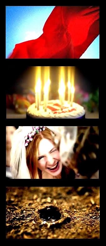
Here are some new graphics!

CrimsonElevenDelightPetrichor.jpg


This next one I made a long time ago but forgot to post. It's officially my first (good) blended graphic. :D
http://i1212.photobucket.com/albums/cc445/Panda_Incognito/GirlWhoWaited1-1.jpg

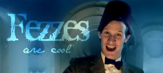
And now here are two graphics I made for the Doctor Who season 6 finale. They bot contain SPOILERS.
http://i1212.photobucket.com/albums/cc445/Panda_Incognito/MiL.jpg
http://i1212.photobucket.com/albums/cc445/Panda_Incognito/Mother-in-lawavatar.jpg

Okay, it took me until I looked at the link title to figure out what the first one was but now I think it's awesome. :D

Love it, so cute.

Heheh, awesome.
 
Very clever to do that one without text. Even fans would have a hard time figuring it out! Awesome job! May I borrow it for.... I don't know, I'll try to find something just as clever to use it with... ja?
 
I like this one, although the girl on the left is a little blurry...

http://i1212.photobucket.com/albums/cc445/Panda_Incognito/GirlWhoWaited1-1.jpg

I can't decide about this one... I think the colors (including the font color) are perfect, but the font doesn't seem to match the picture? hmmm

http://i1212.photobucket.com/albums/cc445/Panda_Incognito/MiL.jpg

Really like this one

http://i1212.photobucket.com/albums/cc445/Panda_Incognito/Mother-in-lawavatar.jpg

I LOVEEE this one! The colors with the perfectly sized black border is perfect! all the pictures are really nice too!

http://i1212.photobucket.com/albums/cc445/Panda_Incognito/CrimsonElevenDelightPetrichor.jpg
 
Very clever to do that one without text. Even fans would have a hard time figuring it out! Awesome job! May I borrow it for.... I don't know, I'll try to find something just as clever to use it with... ja?
You certainly may use it! :D

I like this one, although the girl on the left is a little blurry...

http://i1212.photobucket.com/albums/cc445/Panda_Incognito/GirlWhoWaited1-1.jpg

She isn't actually blurry. The reason she looks funny is because her face is on top of the other picture. I literally have no control over how it turns out, so I was lucky it looked nice at all. :p

I can't decide about this one... I think the colors (including the font color) are perfect, but the font doesn't seem to match the picture? hmmm

http://i1212.photobucket.com/albums/cc445/Panda_Incognito/MiL.jpg
You're right. The font doesn't really go. However, none of the other options I had really went either. I figured it was better to go with a classic font instead of a fancy one which would just look strange. Also, I needed a font which would show up. There was a cursive-like one which looked okay, but it wasn't legible no matter what color I tried. I'm glad you liked the avatar, though.


Thanks for your comments, everyone! :)
 
You're right. The font doesn't really go. However, none of the other options I had really went either. I figured it was better to go with a classic font instead of a fancy one which would just look strange. Also, I needed a font which would show up. There was a cursive-like one which looked okay, but it wasn't legible no matter what color I tried. I'm glad you liked the avatar, though.

Yah its all good! It still works fairly well!

You can go online and google a certain font you'd like if you need more..
 

Ah, the first. Love. :3 That was one of the great moments of that episode. And petrichor is an awesome word.

Heehee. xD Nice. You got the Face. xP The font colors are good too.
That said, here's what I'd do. I'd get a scripty font, size it rather large, and color-pick from Amy's lips to get a nice midshade of pink. I might drop-shadow it to help it blend a bit better.
 
Back
Top