First off, remind me to check your thread more often. When I don't, I get waaay behind and it's hard to cram all your awesome stuff into just one post!
This first fez one is the best. *giggle* It's awesome. xD
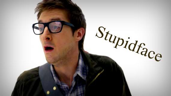
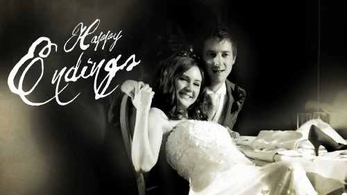
STUPIDFACE! I love it! It's perfect. xD We all love Rory, don't we? <3
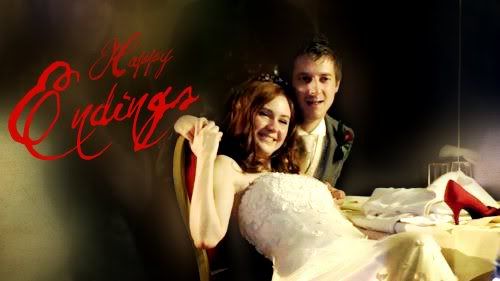
"Girl Who Waited" is good, but like you said, not exceptional.
I like the font and color of the text in "Fighting to the End", but you could work on placement of both the image and the text.
"Gift of Days" is great, and the first is by far the best. The font in the others doesn't really work, but the font in the first is perfect.
I love the font choices and colors in "Growing Old". It's a little gritty, but with improved image quality, it'd be stunning. It's probably my favorite of this set, in all honesty.
The masking thing (brush?) in the middle panel of "36 Years" is great, and I think you should employ it in the other two panels as well. Give it a uniform look.
"Most Beautiful" is good and I like the idea. Personally, I think it might look better if you tried text sculpting, sizing words of importance larger than other words. That helps bring direction, clarity, and impact to a large block of text.
"Don't Let Me In" is good, but I think you could improve it. (I'll critique it further in person, 'kay?)
Both versions of "Being Her" are great. I like the semi-monochrome look with the blue, but I think I prefer the texture. It's subtle, yet adds depth and interest. In regards to the text block on the left, I think you could utilize text sculpting to great effect.
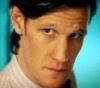
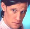
Of the two Doctor avvies, I like the second best; the coloring is better.
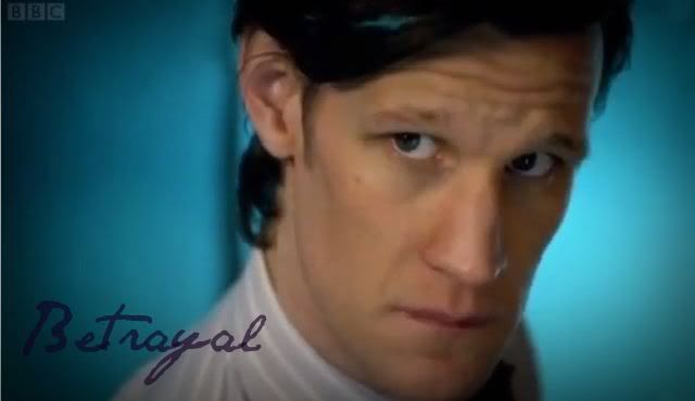
"Betrayal" is very good. The image quality is not the best, but I like what you did with it.
The "Hands" collages are nice, but I think only meaningful to those who have seen the episode and understand the significance. Otherwise, they are just a bunch of juxtaposed pictures of hands. xP
"Oh, Yes I Am" is great. The text positioning could be better, but I understand the constraints of graphic making, so it's not a big deal. What the text actually says makes me feel all "squee xD" inside, but that's beside the point.
"Old Amy" is fantastic. The font color is great, and I love how you nested the text, slightly fading the background text. <3 I think the text might look a tad better if it was straight, but I'm not going to quibble because other than that, it's awesome.
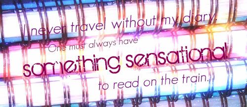
*squee* I absoballylutely love what you did with the journals. All colorful and sparkly and a quote from "The Importance of Being Earnest", no less!
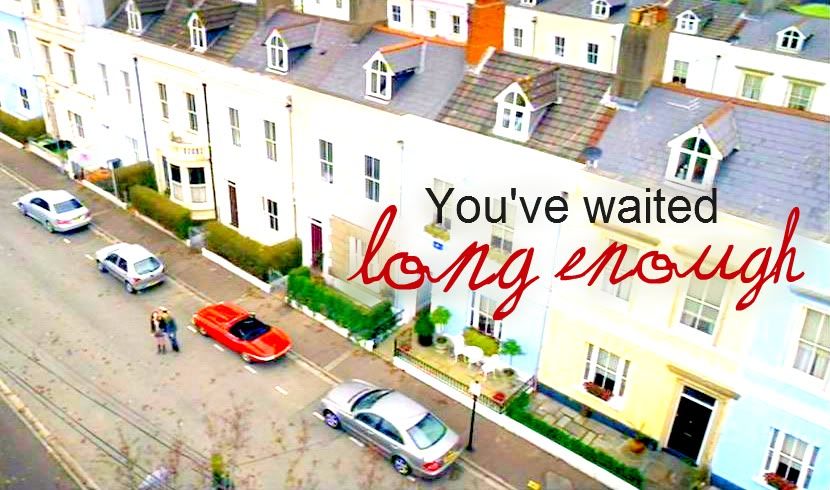
"Long Enough" is brilliant. I love the color and the font you used for the bottom text. The top text might look better if it was serif instead of sans, but whatever. The position of the text is grand. Make more like these! xP
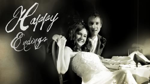
As for "The Girl Who Stopped Waiting", I like the color of the text on the second better, but prefer the position of the text on the first. I understand there are constraints with the modes, but if there was a way to have one's cake and eat it too, it would be perfect. By no means am I saying I dislike the text color of the first: I like it. I simply prefer that of the second.
And that, I believe, wraps up this post. *collapses*
 I would like to look at the others, but I'm not letting myself.

") Neither of the ones I made are particularly wonderful. xP
Neither of the ones I made are particularly wonderful. xP