Yet ANOTHER graphics thread

What do you think of my graphics?

  • They're great!

    Votes: 32 88.9%
  • They're okay.

    Votes: 2 5.6%
  • You'll get better over time- don't worry.

    Votes: 2 5.6%
  • I don't like them that much.

    Votes: 0 0.0%
  • Your graphics are terrible!

    Votes: 0 0.0%

  • Total voters
    36
Thanks!

I appreciate the suggestion, and wanted to try it, but when I looked back at the original photo, I realized it wouldn't work, because she already had a shadow on her eye like that, I just expanded it. So I don't think it would work- at least, not with my current abilities.


Thanks! I'm glad you like it.


Thanks! I like that one a lot except that it kinda looks like she has a black eye because of the purple right there! xP It looks like no one noticed, though.... Or at least didn't say anything. xD


But you're awesome at graphics!!!! o_O Still, I understand how you feel...


Yay, I'm glad you like it! So I take it the second line of text isn't too hard to read? And as for font color, I did color-pick and I was thrilled with how it turned out. =D


Here are some new graphics, all Doctor Who of course. xD

I'm very happy with how this one came out! Here is the original photo, to compare.
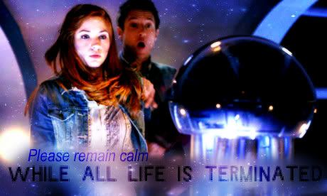
Terminated.jpg


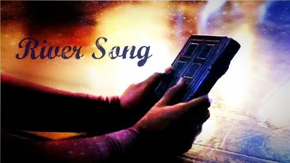
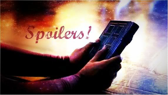
Now here are some graphics I made of River's dairy. ^.^ I can't decide which is my favorite...
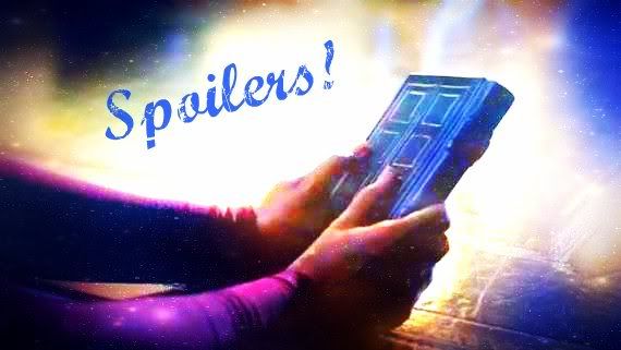
Spoilers.jpg


Spoilers2-3.jpg


Spoilers2-1.jpg

I like the first Spoilers one, River is so awesome in that episode and yet... so... yeah... XD
 
Great work once again! I like this one the best:

Spoilers2-1.jpg


Terminated.jpg


The only Con I have is this one, you can't read the text all the way... But as you know that I know, text colors are a scary thing xD (See how the E and D are hard to see (I got it, its just hard to read))
 
Last edited:
Thanks, everyone! :D

The only Con I have is this one, you can't read the text all the way... But as you know that I know, text colors are a scary thing xD (See how the E and D are hard to see (I got it, its just hard to read)
Yes, I did have trouble with the font colors, because of the color variation in the edited image. I wanted the colors to blend in, but yes, they are a bit hard to read. It also could depend on the lighting of your computer, or, if you're on a laptop, how the screen is angled. When I was slumped in my chair, the e and d were invisible, and I was like :eek:, but then I sat up and could read them again. xP

I can but I guess that's because I know the quote.
Good point. :p That may be why it never occurred to me it was hard to read. xD
 
Haha I actually have a laptop, but I don't use that screen but a bigger one (DUAL SCREEN MUAHAHAH it makes me feel powerful xD) lool I know that feeling :D
 
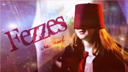
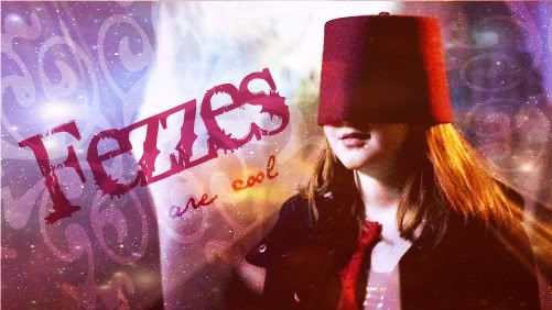
Here are two new graphics. :D I'm quite fond of them, and I can't decide which I like best!

Fezzes1.jpg


Fezzes2.jpg


Expect a lot of new graphics within the next week. I'm going to have soooo much fun making stuff from "The Girl Who Waited". *sniffle* :D
 
Here are two new graphics. :D I'm quite fond of them, and I can't decide which I like best!

Fezzes1.jpg


Fezzes2.jpg


Expect a lot of new graphics within the next week. I'm going to have soooo much fun making stuff from "The Girl Who Waited". *sniffle*

I like the first one as well.

And I'm so glad you're doing this, I don't have time to look up Doctor Who pictures and make graphics but I enjoy yours so much. :D
 
Here are two new graphics. :D I'm quite fond of them, and I can't decide which I like best!

Expect a lot of new graphics within the next week. I'm going to have soooo much fun making stuff from "The Girl Who Waited". *sniffle* :D
I like both.

And if you want, I know this place that ALREADY has screencaps of that episode (along with every other episode). I don't know how they do it but they are here.
 
Oh my goodness! Thank you SO much! :D I was planning on watching the episode again to get tons of screen-captures, but now I don't have to! This is SO helpful, and they're phenomenal quality too, especially compared to what I would have gotten! :D

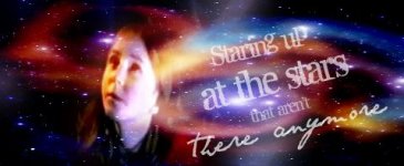
Here is a banner I just made. It's an Owl City/Doctor Who crossover from the beginning of "The Big Bang", the series five season finale. I'm not crazy about the way the banner turned out, but at least it was a cool idea... After all, she was literally staring at stars which weren't there anymore. :D
 

Attachments

  • stars-2.JPG
    stars-2.JPG
    27.2 KB · Views: 43
Last edited:
Oh my goodness! Thank you SO much! :D I was planning on watching the episode again to get tons of screen-captures, but now I don't have to! This is SO helpful, and they're phenomenal quality too, especially compared to what I would have gotten! :D

Here is a banner I just made. It's an Owl City/Doctor Who crossover from the beginning of "The Big Bang", the series five season finale. I'm not crazy about the way the banner turned out, but at least it was a cool idea... After all, she was literally staring at stars which weren't there anymore. :D

And it's a good song... ;)
 
I like both.

And if you want, I know this place that ALREADY has screencaps of that episode (along with every other episode). I don't know how they do it but they are here.

I must thank you, too.:D I know I'll be wanting to make lots of Doctor Who graphics, and getting my own screencaps is a pain.
 
You're welcome both! They have to be good caps since they say they are 720p which is practically Blue-Ray quality. I haven't downloaded much from there since you have to download the whole shebang in one .rar or .zip file! I did download a lot from Firefly though :D
 
And I'm so glad you're doing this, I don't have time to look up Doctor Who pictures and make graphics but I enjoy yours so much.
Yay, I'm glad that you appreciate them!

And it's a good song...

Hee hee. I'm glad you're brave enough to admit it! :D

Wellll... I ended up not getting the screencaps to work for me from the website link BK posted. I'm not sure what was wrong, but it apparently didn't work for my computer. Thankfully, I was still able to get the images I needed, and although the quality isn't as high, I'm content with how my things turned out.

A lot of these graphics are really spoiler-y, so if you haven't yet watched the latest episode of Doctor Who, do yourself a favor and don't look at them! However, if you wouldn't watch it anyway, I guess it doesn't matter. xP

I'm giving direct links to the spoiler-y ones.

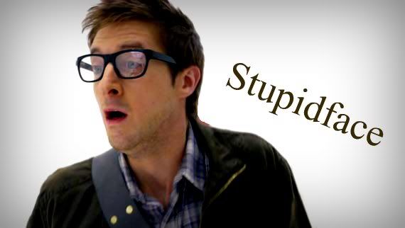
I like this one. xD
Stupidface-1.jpg


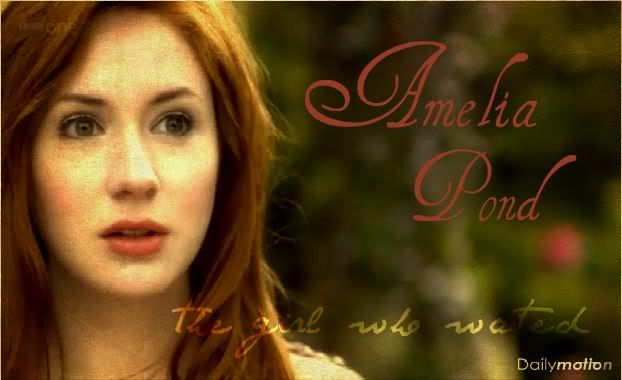
This was a gorgeous picture, but I'm not terribly excited over how it turned out with my editing skills. It looks fine, but nothing special.
GirlWhoWaited.jpg


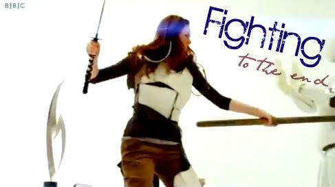
I don't really like this next one. I had trouble picking a good font, and honestly think that the original picture looked better. xP
TotheEnd.jpg


Now here are direct links to three spoiler-y graphics. I made this one three different ways because I wasn't sure which would look better.
http://i1212.photobucket.com/albums/cc445/Panda_Incognito/GiftofDays-1.jpg
http://i1212.photobucket.com/albums/cc445/Panda_Incognito/GiftofDays-2.jpg
http://i1212.photobucket.com/albums/cc445/Panda_Incognito/GiftofDays-3.jpg

I really, really like this next one. I'm not saying that it's really all that good artistically, but I really, really like it.
http://i1212.photobucket.com/albums/cc445/Panda_Incognito/Growold.jpg

This one looks kind of weird, but I like it anyway. *sniff*
http://i1212.photobucket.com/albums/cc445/Panda_Incognito/in36years.png

I'm not a huge fan of the way this one turned out, but it's more the thought expressed than the wallie's artistic merit that counts. xP I don't like the font I used for the bulk of the text, but it was the only one skinny enough to fit properly.
http://i1212.photobucket.com/albums/cc445/Panda_Incognito/MostBeautiful.jpg

I cried while I was making these next three:

http://i1212.photobucket.com/albums/cc445/Panda_Incognito/DontLetMeIn.jpg

http://i1212.photobucket.com/albums/cc445/Panda_Incognito/Beingher-1.jpg
http://i1212.photobucket.com/albums/cc445/Panda_Incognito/BeingHer2.jpg

Of the last two, I prefer the one without the texture, but I'm posting the version with it too, so that you guys can compare.

I hope you guys enjoy these just a fraction of how much I enjoyed making them! :')
 
Last edited:
The font goes AMAZINGLY with this one! Love it! xD

Stupidface-1.jpg


Very pretty! But once again, I just wanted to tell you its a lil hard to read the words... But this'll be the last time I'll complain about that, just wanted to let you know...

GirlWhoWaited.jpg


I REALLY like the font you chose! I can't really see what the pics of though!

TotheEnd.jpg


Check the links on these again, I think you posted three of the exact same pic :D (I can't tell a difference)

This one looks kind of weird, but I like it anyway. *sniff*
http://i1212.photobucket.com/albums/cc445/Panda_Incognito/in36years.png

Lool REALLY funny! I really like it! I don't have any complaints!


I'm not a huge fan of the way this one turned out, but it's more the thought expressed than the wallie's artistic merit that counts. xP I don't like the font I used for the bulk of the text, but it was the only one skinny enough to fit properly.
http://i1212.photobucket.com/albums/cc445/Panda_Incognito/MostBeautiful.jpg

Really great quote, and I really like how it turned out! The font size/coloring matches the mood!

Grrrr, I can't decide between the two! I spy the BBC symbol xD

http://i1212.photobucket.com/albums/cc445/Panda_Incognito/Beingher-1.jpg
http://i1212.photobucket.com/albums/cc445/Panda_Incognito/BeingHer2.jpg


Although I had some complaints, I LOVED all of them, and literally take my complaints like a grain of sand! I was being as picky as I could, and I don't want you to feel like your graphics aren't good! I just love when people criticize my graphics so I can learn from my mistake! Anyhow GREAT job!
 
Oh my goodness, thanks SO much for pointing out that I accidentally posted a link to the same photo three times! xP I'll go back and fix that!

Thanks for all your helpful comments.
 
Back
Top