I'm sure the font and text placement could be improved, but I really love the quote with that image. ^^
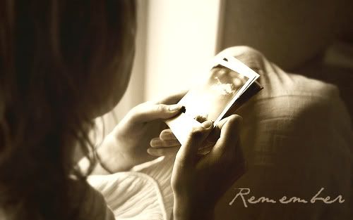
O.O *falls over* That. is. awesome. I really like the dark sepia tones, the shadows and darkness contrasted with light. It's very evocative. The font fits, and the text placement is subtle: unobtrusive and simple. Very nice.
I like what you did with the colors here, but I think the angled text detracts from the overall effect. I think if it was straight across the far bank (upper right-ish) or straight against the water in the lower left corner it would look a little better.
That just looks so
fun. Here, the angled text works. The colors, the saturation, and the bokeh are all great. It just really looks so fun. :3
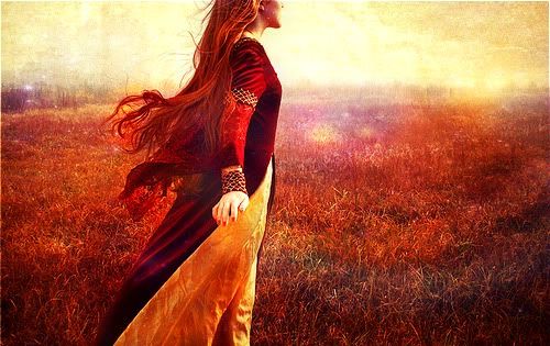
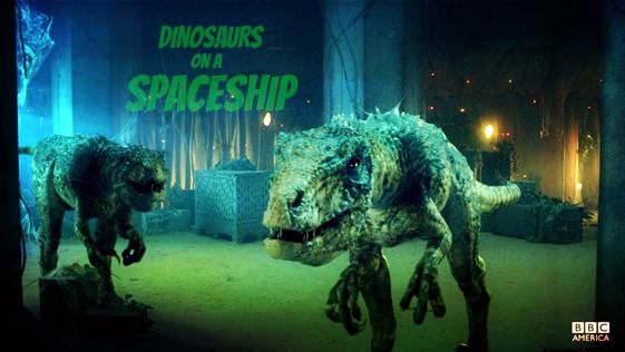
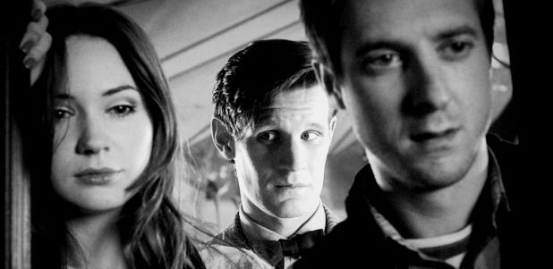
How can I choose a favorite? o.o The first is very pretty, and I prefer it to the second. The second might look better with olive text, because the white text is a little stark, but it is simple and does complement the white notes in the image. The white text fits wonderfully on the latter two. The third is nice and clear and tasteful; the over-saturated shadow in the fourth illustrates the darkness in the Doctor. Very well done, all of them. ^^
That is so very much the twins. xD I like the font you used; it goes very well with the playfulness of the Winnie the Pooh images. Good choice on font color, too: it complements without being super matchy, doesn't detract,
and remains legible.
*chuckle* Oh, very nice indeed! It fits them so well. I think I prefer the one with the texture; however, I would erase the texture that lies over them so that they stay vibrant and aren't darkened so much.
"The Most Wonderful Thing" is good, but the text looks a little squished on the second. I know you can't do this with the program you currently use, but if you shifted the image a little to the right so that there was more white space on the left, it would look more balanced. Also, it would be amusing if Eeyore had a little line saying something like, "Well, that's a relief."

I liked all of these, but my favorite was the fourth. The space texture is a little heavy, but I really like the positioning of the images and the text. ^^
I really like both "Fades Away", and it's hard for me to choose between them. I prefer 1-1's clearer, lighter green color, yet 2's blurred focus adds to the ethereal air.
My favorite of "Paradise" is the first; the brushes are too heavy on the other two. However, I really like the text placement on the last, so if you lightened both the brush and the text (as in the first), it would probably win out. You colored the image very tastefully, and it is one of my favorites of your work. :3
*chuckle* Oh, Owl. xD That's the perfect image for the text, D. Brava.
And all I can see is Crystal and Evelyn.
Oh, I like that. ^^ It's a liiiittle dark on his face, but it'd probably looks strange if it wasn't.


