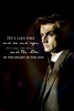
Really? Thank you. In that case, forget what I said about it being ugly. xP And honestly, I think I'd just been staring at it too long. Looking at it with a fresh perspective, it looks fine.
Now for more graphics! =D
THESE CONTAIN SPOILERS! If you have not seen the episode, and intend ever to do so, please do not look at these. If you don't watch Doctor Who at all, and don't plan on doing so, go ahead and look at them, though you won't get the full effect without the story. xP These will be best appreciated by those who have seen the episode.
Also, please be considerate when commenting on the graphics. Be cryptic enough that I will know what you mean, but don't say "the one with such and such in it", because I really don't want the episode to be spoiled for anyone. Thank you so much!
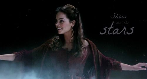
I really like these two. I think I may prefer the large text in dark, but I can't really decide between them.
http://i1212.photobucket.com/albums/cc445/Panda_Incognito/Always-1.jpg
http://i1212.photobucket.com/albums/cc445/Panda_Incognito/Always-2.jpg
[
Original image]
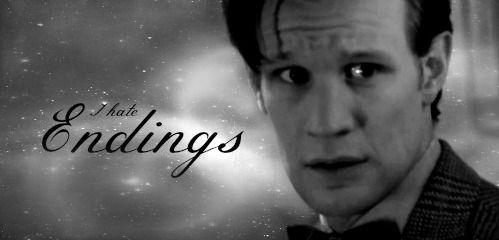
This graphic is not artistically amazing, but it's such a fun quote.
 I thought it was really neat how they made the Statue of Liberty into a weeping angel after so many people have made jokes about how it could be one, yet never comes to life because there's always somebody looking at it. xD
http://i1212.photobucket.com/albums/cc445/Panda_Incognito/Impatient.jpg
[
Original image]
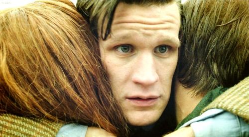
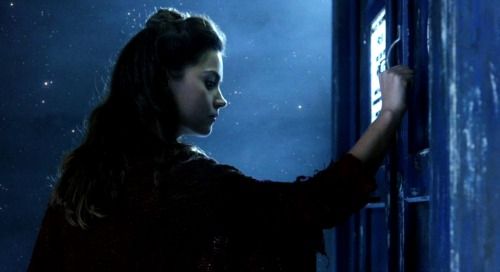
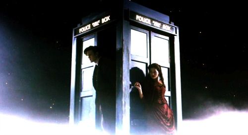
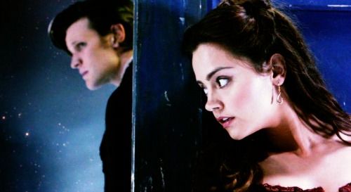
I really, really loved this scene. *sniffles* I made two separate graphics out of it, and then beneath there is a collage with images from that scene. There is no text, however, because there was neither a place nor words to express it all. *more sniffles*
http://i1212.photobucket.com/albums/cc445/Panda_Incognito/Anything.jpg
http://i1212.photobucket.com/albums/cc445/Panda_Incognito/Together.jpg
[
Original image]
http://i1212.photobucket.com/albums/cc445/Panda_Incognito/TogetherCollage.jpg
I cried so hard in this scene that it isn't even funny. There weren't just tears in my eyes. I'm talking heavy sobs... My poor mother thought I'd lost my mind, even though I'd sort of warned her that I was going to be emotionally unstable after watching this episode.
http://i1212.photobucket.com/albums/cc445/Panda_Incognito/OneMoreName.jpg
[
Original image]
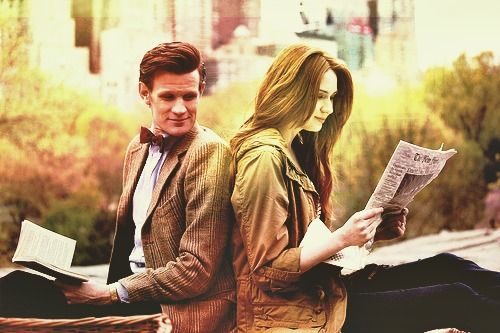
Here we have two different versions of a collage I made. I prefer the second, with the text all together in one spot, even though it's awfully small. I couldn't make the collage itself any larger because of image quality issues, and thus the text had to be tiny.
http://i1212.photobucket.com/albums/cc445/Panda_Incognito/TheStoryofAmeliaPond-1.jpg
http://i1212.photobucket.com/albums/cc445/Panda_Incognito/TheStoryofAmeliaPond-2.jpg
This scene was such a perfect ending to the fabulous, heart-breaking episode. Oh, Steven Moffat, why did I ever doubt you? You always write the best episodes, even if I dread them and think that they'll be too tragic to bear. The beauty and hope of the end, in spite of all that happened, is why I love Doctor Who so much.
http://i1212.photobucket.com/albums/cc445/Panda_Incognito/Ends.jpg
[
Original image]


