You are using an out of date browser. It may not display this or other websites correctly.
You should upgrade or use an alternative browser.
You should upgrade or use an alternative browser.
QLTV's Graphics
- Thread starter QueenLucyTheValient
- Start date
I really like the Arwen one that you posted!
QueenLucyTheValient
New member
Thanks!!!! I like the Celtic Thunder Storm one and the Keith Harkin one as well. Oh, and Keith Harkin is a member of Celtic Thunder. ")
Here is my new batch. I must say, I believe that this is THE BEST set of graphics I have EVER made. I just found tons of new textures and am loving them!!! WOOTWOOT!!!
I made another Wallie, and thats coming in the next post as well..
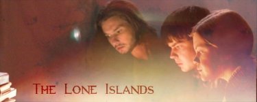
The Narnia Lone Islands one I think I made yesterday, but forgot to post it.
I love the other four so much I cant pick a favorite.
Here is my new batch. I must say, I believe that this is THE BEST set of graphics I have EVER made.
I just found tons of new textures and am loving them!!! WOOTWOOT!!! I made another Wallie, and thats coming in the next post as well..
The Narnia Lone Islands one I think I made yesterday, but forgot to post it.
I love the other four so much I cant pick a favorite.
Attachments

Last edited:
QueenLucyTheValient
New member

ahyperdude
New member
Ooooh these look sweet! (takes a close look)
k here is what I think (favorites first)
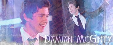
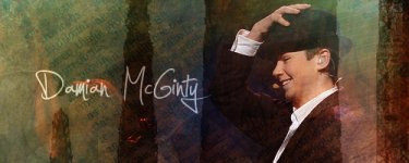
1. Damian won me over this time! I like this one best! I LOVE the blue color scale to it (with the white letters) It has a really good feel, and it doesn't feel crowded (but still feels sophisticated)
http://www.narniafans.com/forum/attachment.php?attachmentid=10165&stc=1&d=1325649529
2. I like the Lone Islands one second. I like the color scale as well with this one (the red REALLY matches the scene) Great font, and still keeping it simple! (not as sophisticated though)
http://www.narniafans.com/forum/attachment.php?attachmentid=10168&stc=1&d=1325649576
3. I like this one fairly better than the next BECAUSE of the color scale (the greenish background. I also like the texture on the left side.) I can't read the words of course, but it still works VERY well! (things like that usually annoy me, but I liked it)
http://www.narniafans.com/forum/attachment.php?attachmentid=10164&stc=1&d=1325649523
(the first three are the ones I especially like!)
4. Like I said, I feel like the color scale is a little off on this one. Its a smiling guy with happy lyrics, and yet there's almost fire in the background. I DO like the words though (and the words in the background) another complaint would be that the black words are a tad hard to read. (no big deal though)
http://www.narniafans.com/forum/attachment.php?attachmentid=10167&stc=1&d=1325649566
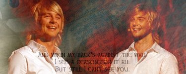
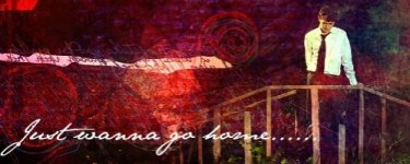
5. This one is nice, it seems a little repetitive to me though (two bridge pics on top, two crossed arms on the bottom. Other than that, I LOVE how you incorporated the green and blues together. The words are also excellent and VERY readable!
http://www.narniafans.com/forum/attachment.php?attachmentid=10170&stc=1&d=1325649749
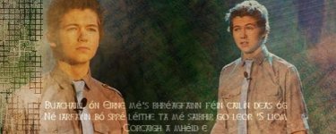
6. Lastly "The Dark Destroyer". You didn't do a bad job with this one at all (I can definitely see the work that went into it) but something irks me about it, I'm not sure. I really don't care for the red and green scale (I think thats it) But then I think, it matches the pic and "The Dark Destroyer" words.
http://www.narniafans.com/forum/attachment.php?attachmentid=10169&stc=1&d=1325649660
GREAT JOB with this batch! The style seemed a little different then usual to me, but even if thats true, you did an AMAZING job and I agree this is one of your best batches! Great work")
k here is what I think (favorites first)
1. Damian won me over this time! I like this one best! I LOVE the blue color scale to it (with the white letters) It has a really good feel, and it doesn't feel crowded (but still feels sophisticated)
http://www.narniafans.com/forum/attachment.php?attachmentid=10165&stc=1&d=1325649529
2. I like the Lone Islands one second. I like the color scale as well with this one (the red REALLY matches the scene) Great font, and still keeping it simple! (not as sophisticated though)
http://www.narniafans.com/forum/attachment.php?attachmentid=10168&stc=1&d=1325649576
3. I like this one fairly better than the next BECAUSE of the color scale (the greenish background. I also like the texture on the left side.) I can't read the words of course, but it still works VERY well! (things like that usually annoy me, but I liked it)
http://www.narniafans.com/forum/attachment.php?attachmentid=10164&stc=1&d=1325649523
(the first three are the ones I especially like!)
4. Like I said, I feel like the color scale is a little off on this one. Its a smiling guy with happy lyrics, and yet there's almost fire in the background
. I DO like the words though (and the words in the background) another complaint would be that the black words are a tad hard to read. (no big deal though)http://www.narniafans.com/forum/attachment.php?attachmentid=10167&stc=1&d=1325649566
5. This one is nice, it seems a little repetitive to me though (two bridge pics on top, two crossed arms on the bottom. Other than that, I LOVE how you incorporated the green and blues together. The words are also excellent and VERY readable!
http://www.narniafans.com/forum/attachment.php?attachmentid=10170&stc=1&d=1325649749
6. Lastly "The Dark Destroyer". You didn't do a bad job with this one at all (I can definitely see the work that went into it) but something irks me about it, I'm not sure. I really don't care for the red and green scale (I think thats it) But then I think, it matches the pic and "The Dark Destroyer" words.
http://www.narniafans.com/forum/attachment.php?attachmentid=10169&stc=1&d=1325649660
GREAT JOB with this batch! The style seemed a little different then usual to me, but even if thats true, you did an AMAZING job and I agree this is one of your best batches! Great work
Last edited:
QueenLucyTheValient
New member
Thanks Hyper!! YOur comment was appreciated.
I have more.. if anyone is interested.
First Damian one... Its got a bit of a 'Dark Destroyer' Ryan-like look to it... But I still like it.
Second Damian one... I love it. It looks perfect. His eyes are amazing, and the colors were really good matches, in my opinion.
The Ryan Kelly one was... PERFECT!!! :-D No other words to express its awesomeness.
The Pippin one.. I love Pippin... This one was alright.. It could have been better had I had the patience.
Attachments

QueenLucyTheValient
New member
Frodosgurl
Well-known member
Your graphics are amazing!
ahyperdude
New member
My thoughts:
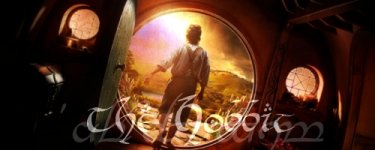
1. The hobbit one is my fav! You kept it pretty simple and I like that! I (once again) LOVED the LOTR font/font color! 10-10 great job!
http://www.narniafans.com/forum/attachment.php?attachmentid=10183&stc=1&d=1325739733
2. Looks like you met your brothers request this time! This is second on my list! I love the white, green, and red color scale! The green is amazing and I love the picture!
http://www.narniafans.com/forum/attachment.php?attachmentid=10182&stc=1&d=1325739727
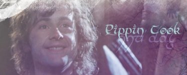
3. I love your LOTR ones. I only had two complaints about this one. First, it seems a little light to me, and, second, the words "Pippin Look" seems a little weird to me. (again NBD)
http://www.narniafans.com/forum/attachment.php?attachmentid=10181&stc=1&d=1325737441
4. The red texture/color scale matches the pic perfectly! Great pic and words!
http://www.narniafans.com/forum/attachment.php?attachmentid=10178&stc=1&d=1325737413
(the next two, in my opinion, aren't as amazing)
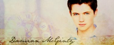
5. Colors are OK on this one, and the clock seems a lil out of place. His blue eyes go great with the white though!
http://www.narniafans.com/forum/attachment.php?attachmentid=10179&stc=1&d=1325737422
6. This one confuses me! I think there's too much going on. Words/multiple textures/fading etc. too much fading and its a little hard to read the words. I LOVE the red color and texture colors!
http://www.narniafans.com/forum/attachment.php?attachmentid=10180&stc=1&d=1325737434
I especially LOVED the first two!
1. The hobbit one is my fav! You kept it pretty simple and I like that! I (once again) LOVED the LOTR font/font color! 10-10 great job!
http://www.narniafans.com/forum/attachment.php?attachmentid=10183&stc=1&d=1325739733
2. Looks like you met your brothers request this time! This is second on my list! I love the white, green, and red color scale! The green is amazing and I love the picture!
http://www.narniafans.com/forum/attachment.php?attachmentid=10182&stc=1&d=1325739727
3. I love your LOTR ones. I only had two complaints about this one. First, it seems a little light to me, and, second, the words "Pippin Look" seems a little weird to me. (again NBD)
http://www.narniafans.com/forum/attachment.php?attachmentid=10181&stc=1&d=1325737441
4. The red texture/color scale matches the pic perfectly! Great pic and words!
http://www.narniafans.com/forum/attachment.php?attachmentid=10178&stc=1&d=1325737413
(the next two, in my opinion, aren't as amazing)
5. Colors are OK on this one, and the clock seems a lil out of place. His blue eyes go great with the white though!
http://www.narniafans.com/forum/attachment.php?attachmentid=10179&stc=1&d=1325737422
6. This one confuses me! I think there's too much going on. Words/multiple textures/fading etc. too much fading and its a little hard to read the words. I LOVE the red color and texture colors!
http://www.narniafans.com/forum/attachment.php?attachmentid=10180&stc=1&d=1325737434
I especially LOVED the first two!
QueenLucyTheValient
New member
Wow, Thanks y'all!! The Comments are amazing! Keep 'em coming!
Frodosgurl: Wow, thanks!! That means a lot to me!
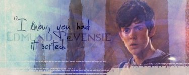
Hyper: The Pippin one says "Pippin Took" not 'Pippin Look' lol.
Zella: THanks!! I love that Damian one.
Here are some more. Hope y'all like 'em.
I like the last two best, but I like the other two a little less than the last two.. The first Damo ones coloring is a little.. yellow.. Oh well... and Paul looks funny in the Celtic Thunder one. Damo doesnt, Ryan doesnt, but Paul does.. and Keith kinda does.. George doesnt... But does George ever look weird?
Frodosgurl: Wow, thanks!!
That means a lot to me! Hyper: The Pippin one says "Pippin Took" not 'Pippin Look' lol.
Zella: THanks!!
I love that Damian one. Here are some more. Hope y'all like 'em.
I like the last two best, but I like the other two a little less than the last two.. The first Damo ones coloring is a little.. yellow.. Oh well... and Paul looks funny in the Celtic Thunder one. Damo doesnt, Ryan doesnt, but Paul does.. and Keith kinda does.. George doesnt... But does George ever look weird?
Attachments


Last edited:
ahyperdude
New member
Wow, Thanks y'all!! The Comments are amazing! Keep 'em coming!
Hyper: The Pippin one says "Pippin Took" not 'Pippin Look' lol.
Sure! I enjoy it!
LOL sorry about that, xD. Makes allot more sense now! (I'll still keep it at 3rd though)
My comments:
1. The "Celtic Thunder" one is my fav!
2. I like the "Edmund" one second
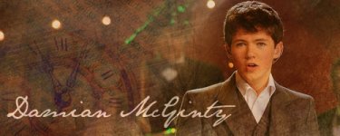
3. The "18" Damian one 3rd
4. and the other Damian one 4th
QueenLucyTheValient
New member
Thanks Hyper, Zella! Your comments are great!!
So I made a couple more, and guess what!! I made more Narnia ones!! There are still Damian ones, but there are Narnia ones!! And I loveth them.
So the first Narnia one is alright.. I think the colors were a tad off.. Oh well...
Same with the Damian Avvie.. that one is fine, just the colors look kinda funny.
The other two Damian ones are probably my favorites! Especially the second one.
But I love the Peter one from the duel. That one was pretty good, in my own opinion.
Attachments


ahyperdude
New member
YAY I LOVE YOUR NARNIA ONES
Alrighty here are my comments:
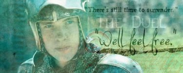
1. This is my fav BECAUSE of the colors! I LOVE THEM! HAHA I like the words, although "Well Feel Free" Doesn't seem to match the look on Peters face. Also Its a little confusing with "The Duel" in the middle. BUT maybe I'm just stupid. I LOVE it!
http://www.narniafans.com/forum/attachment.php?attachmentid=10200&stc=1&d=1325985001
2. I really like this one! The colors are LOVELY! I also love the font!
http://www.narniafans.com/forum/attachment.php?attachmentid=10198&stc=1&d=1325984972
(I'm a sucker for colors. These two are my tops)
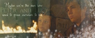
3. I like this one next, I don't care for the white ball things at the bottom right corner, it takes away from the rest. The colors are pretty swell. (again I don't care for the words, like how "Peter and Lucy" are in the middle. the other words a good though)
http://www.narniafans.com/forum/attachment.php?attachmentid=10199&stc=1&d=1325984986
4. This next
http://www.narniafans.com/forum/attachment.php?attachmentid=10196&stc=1&d=1325984954
5. and this last
http://www.narniafans.com/forum/attachment.php?attachmentid=10197&stc=1&d=1325984964
Alrighty here are my comments:
1. This is my fav BECAUSE of the colors! I LOVE THEM! HAHA I like the words, although "Well Feel Free" Doesn't seem to match the look on Peters face. Also Its a little confusing with "The Duel" in the middle. BUT maybe I'm just stupid
. I LOVE it!http://www.narniafans.com/forum/attachment.php?attachmentid=10200&stc=1&d=1325985001
2. I really like this one! The colors are LOVELY! I also love the font!
http://www.narniafans.com/forum/attachment.php?attachmentid=10198&stc=1&d=1325984972
(I'm a sucker for colors
. These two are my tops)3. I like this one next, I don't care for the white ball things at the bottom right corner, it takes away from the rest. The colors are pretty swell. (again I don't care for the words, like how "Peter and Lucy" are in the middle. the other words a good though)
http://www.narniafans.com/forum/attachment.php?attachmentid=10199&stc=1&d=1325984986
4. This next
http://www.narniafans.com/forum/attachment.php?attachmentid=10196&stc=1&d=1325984954
5. and this last
http://www.narniafans.com/forum/attachment.php?attachmentid=10197&stc=1&d=1325984964
QueenLucyTheValient
New member
Hey guys! Sorry I haven't posted anything in a while. I havent had much time to get on the computer. Thanks for the comments on my last set of graphics, by the way.
Okay, I have some new stuff for ya. I highly doubt any of you will know what these are from, unless you are a fan of Stargate Atlantis.
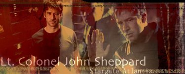
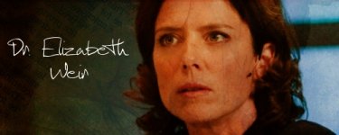
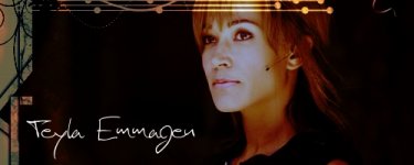
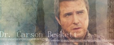
So basically, for those who dont know what Stargate Atlantis is about, its about this ring, called a stargate, that is able to create these wormholes to stargates on other planets. These people called the Ancients created them, and the whole thing with SGAtlantis is that they go to the Pegasus galaxy using a Stargate, and they discover the lost city of Atlantis, which the Ancients had made in that galaxy, and after fighting with these people whose power rivaled their own, they sunk the city. So John Sheppard is the military commander of the expedition, Dr. Weir is the leader of the expedition, Teyla is an 'alien' person, someone they met on another planet and she joined the expedition, and then Dr. Beckett is the doctor. Its kinda a creepy show sometimes though. anyways. Enough of my ranting, here are the banners.
I have to say, i like the blended version of the Sheppard banner way better. I also like the Beckett and Tayla ones a lot. Anyways.. Here ya go.
Thanks for the comments on my last set of graphics, by the way. Okay, I have some new stuff for ya. I highly doubt any of you will know what these are from, unless you are a fan of Stargate Atlantis.
So basically, for those who dont know what Stargate Atlantis is about, its about this ring, called a stargate, that is able to create these wormholes to stargates on other planets. These people called the Ancients created them, and the whole thing with SGAtlantis is that they go to the Pegasus galaxy using a Stargate, and they discover the lost city of Atlantis, which the Ancients had made in that galaxy, and after fighting with these people whose power rivaled their own, they sunk the city. So John Sheppard is the military commander of the expedition, Dr. Weir is the leader of the expedition, Teyla is an 'alien' person, someone they met on another planet and she joined the expedition, and then Dr. Beckett is the doctor. Its kinda a creepy show sometimes though.
anyways. Enough of my ranting, here are the banners. I have to say, i like the blended version of the Sheppard banner way better. I also like the Beckett and Tayla ones a lot. Anyways.. Here ya go.
Attachments

ahyperdude
New member
I never base my ratings off if I don't know who the person is, or if I don't like the person..
I base it completely off design
I also wanted to say I really liked the one you chose for your sig! It matches your avi
Here are my favs (highest to lowest)
1) So simple, and a great color scale
http://www.narniafans.com/forum/attachment.php?attachmentid=10390&stc=1&d=1329006945
2)GREAT font for the person, and the colors are nice. I also like the graphic on the top!
http://www.narniafans.com/forum/attachment.php?attachmentid=10393&stc=1&d=1329006980
3)Almost too busy, but it has really nice colors
http://www.narniafans.com/forum/attachment.php?attachmentid=10394&stc=1&d=1329007535
4)The white matches her face, but the colors are a tad off other than that
http://www.narniafans.com/forum/attachment.php?attachmentid=10392&stc=1&d=1329006963
5)This seems REALLY crowded to me. And I don't care for the red color scale. BUT it does look good as your banner (as I said before) You used it in the right way
http://www.narniafans.com/forum/attachment.php?attachmentid=10391&stc=1&d=1329006956
I'm so glad to see more of your work! I've missed it great job
I base it completely off design
I also wanted to say I really liked the one you chose for your sig! It matches your avi
Here are my favs (highest to lowest)
1) So simple, and a great color scale
http://www.narniafans.com/forum/attachment.php?attachmentid=10390&stc=1&d=1329006945
2)GREAT font for the person, and the colors are nice. I also like the graphic on the top!
http://www.narniafans.com/forum/attachment.php?attachmentid=10393&stc=1&d=1329006980
3)Almost too busy, but it has really nice colors
http://www.narniafans.com/forum/attachment.php?attachmentid=10394&stc=1&d=1329007535
4)The white matches her face, but the colors are a tad off other than that
http://www.narniafans.com/forum/attachment.php?attachmentid=10392&stc=1&d=1329006963
5)This seems REALLY crowded to me. And I don't care for the red color scale. BUT it does look good as your banner (as I said before) You used it in the right way
http://www.narniafans.com/forum/attachment.php?attachmentid=10391&stc=1&d=1329006956
I'm so glad to see more of your work! I've missed it
great job