QLTV's Graphics

How do you like my graphics?

  • They are awful!! :(

    Votes: 0 0.0%

  • Total voters
    23
GIMP Tutorial 1

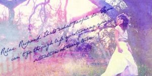
I used this image in my graphic. As you know, Ive been in a really big Phelps Twins mood
phelpstwin4.jpg


First open up your image. I shouldn’t have to say this, but in all of the other tutorials I have seen, they have said that, so whatevs..

Flatten the image. (Go to Image>Flatten Image)

Open a new layer and fill it with color 131347 (on the side bar with all the little symbols, at the bottom, should be these two color thingys. Clich the top one and imput the # into the text ‘box’ :o) Set layer to Screen 100%.

Duplicate layer twice, so you have three layers of 131347. Set the last one to Subtract 100%

Flatten image again.

Open this texture, position it to your liking, and set it to Burn 100%: http://i1101.photobucket.com/albums...tleMagnificent/Textures/_splatt_texture_6.png

Open a new layer and fill it with ead993. Set to Soft Light 100%

Open this layer and set it to Burn 42%
http://i1101.photobucket.com/albums/g434/TheValientJustGentleMagnificent/Textures/grunge05.jpg
grunge05.jpg


Finally, I added this texture and set it to Screen 100%: http://i1101.photobucket.com/albums/g434/TheValientJustGentleMagnificent/Textures/22.png

22.png


Flatten image.

I decided to call it good at this.
 
Tutorial 2

Open your image. I used this image: http://i1101.photobucket.com/albums...agnificent/Textures/girlwithballoonsstock.jpg

girlwithballoonsstock.jpg


move around and flatten when happy.

Duplicate image and go to Colors>Auto>White Balance. Set duplicated image to Soft Light 100%

Open this texture: http://i1101.photobucket.com/albums...nificent/Textures/ohfreckle_textures119_6.jpg

ohfreckle_textures119_6.jpg


Set it to Multiply 100%

Open this texture and set to Screen 100%: http://i1101.photobucket.com/albums/g434/TheValientJustGentleMagnificent/Textures/texture_13.jpg

texture_13.jpg


Open a new layer and fill it with the color black. Set the layer to Grain Merge 70%

Add some text. I used the font called Jane Austen.
 
GRAPHICS ON PREVIOUS PAGE!! let me know what you think of them. they are the last post on the last page.


Tutorial 3

Open your image. This is what I used:
http://i1101.photobucket.com/albums/g434/TheValientJustGentleMagnificent/Textures/Phelpstwinpic1.png

open a new layer and fill it with 131347. Set to screen 100%. Duplicate it twice, so you have three layers of 131347. Set the last one to Subtract 100%.

Open this texture and set it to Darken Only 64%:
grunge03.jpg


http://i1101.photobucket.com/albums/g434/TheValientJustGentleMagnificent/Textures/grunge03.jpg

Open this texture and set it to soft light 100%:
texture_6.jpg


http://i1101.photobucket.com/albums/g434/TheValientJustGentleMagnificent/Textures/texture_6.jpg

open this texture, resize it, and set it to Darken Only 100%. You may have to move it around to get it exactly where you want it:
texture5.jpg


http://i1101.photobucket.com/albums/g434/TheValientJustGentleMagnificent/Textures/texture5.jpg

Flatten Image.

Open this texture, set it to Screen 100%, and move it around until happy:
text20.png


http://i1101.photobucket.com/albums/g434/TheValientJustGentleMagnificent/Textures/text20.png

Flatten image and save. ☺
 
Thanks you two!!!

The Who Am I banner was one I forgot to post with the last batch..

The tutorials you asked for, Hyper, will be in the next few posts.. It may take a few posts..

the tutorials are for the two phelps twins banners and the Breakaway banner (the one with the girl in the field with balloons.)

Alrighty! Thanks SO much for the tutorials!!! I sent a message with some questions, so I'll limit what I say, to what I think of the graphics ;)

First off, I absolutely LOVE this batch! The balloon and flower one are exactly the style I LOVE :)

So, my favorite is this: http://www.narniafans.com/forum/attachment.php?attachmentid=11090&stc=1&d=1340421101
I had a REALLY hard time reading it at first, but I got it eventually :P. Other then that it's hard to read, I really can't take anything off. I mean, I can't even take off for the words! Just look at them, they compliment the graphic perfectly :-D 10-10

Next, is this one: http://www.narniafans.com/forum/attachment.php?attachmentid=11091&stc=1&d=1340422710
I'm in love with the blueish background in contrast with the white words! The font is SPOT on :). But YIKES are those words supposed to be readable? Once again though, I don't really care because of how GOOD it makes the graphic look! 10-10! I especially love the vibrant colors!

After that, is this one: http://www.narniafans.com/forum/attachment.php?attachmentid=11092&stc=1&d=1340422723
The colors are BEAUTIFUL! I feel as if the angle is a tad off with the words and I don't think the font works as good on this one as for the others, so 9-10

Lastly, comes this one: http://www.narniafans.com/forum/attachment.php?attachmentid=11093&stc=1&d=1340423301
But actually, this one is perfect! I can't take off for this so 10-10 :D.. Just put this one above the previous :P


Overall, GREAT work! I'm in love with SO many of these :-D I'm really thinking I'll make a request if you'd be up to it. (but we'll see) I feel so bad critiquing these knowing how much hard work went into them! I definitely go to harsh sometimes, so I'll try to be more level headed :P
 
Next, is this one: http://www.narniafans.com/forum/attachment.php?attachmentid=11091&stc=1&d=1340422710
I'm in love with the blueish background in contrast with the white words! The font is SPOT on . But YIKES are those words supposed to be readable? Once again though, I don't really care because of how GOOD it makes the graphic look! 10-10! I especially love the vibrant colors!


Overall, GREAT work! I'm in love with SO many of these :-D I'm really thinking I'll make a request if you'd be up to it. (but we'll see) I feel so bad critiquing these knowing how much hard work went into them! I definitely go to harsh sometimes, so I'll try to be more level headed :P

Lol on that one it wasn't supposed to be readable.. But yea...

I sooooo hope you request something!!! I would love a request.. Just be sure to provide pictures if you can. It makes it easier for me. and tell me exactly what you want.

So here are some new ones. :) I have tutorials for all except the Pevensie's one.. :) let me know what you think and if you want a tutorial for one of them. :)

EDIT: I just realized that the text on the last one is hard to read. It says "Relax. Respond. That's what people do. You can't go through life questioning your situation at every turn." And the quote is from Rosencrantz and Guildenstern are Dead. :)
 

Attachments

  • jamesandoliverphelpsbanner6.jpg
    jamesandoliverphelpsbanner6.jpg
    80.9 KB · Views: 43
  • pevensiesbanner.jpg
    pevensiesbanner.jpg
    23 KB · Views: 41
  • RandGaredeadquotebanner.jpg
    RandGaredeadquotebanner.jpg
    28.1 KB · Views: 48
Last edited:
Lol on that one it wasn't supposed to be readable.. But yea...

I sooooo hope you request something!!! I would love a request.. Just be sure to provide pictures if you can. It makes it easier for me. and tell me exactly what you want.

So here are some new ones. :) I have tutorials for all except the Pevensie's one.. :) let me know what you think and if you want a tutorial for one of them. :)

EDIT: I just realized that the text on the last one is hard to read. It says "Relax. Respond. That's what people do. You can't go through life questioning your situation at every turn." And the quote is from Rosencrantz and Guildenstern are Dead. :)

I like the last one, even though it is hard to read.
 
QLTV.

I AM IN LOVE!

I LOVE THESE!!! :D

I Can't decide between the Pevensee one and the Girl with the dress one!

Alright, I'm going to go with Pevensees first!
The colors are AMAZING! Edmunds shirt MAKES this picture, and of course your effects with the words just make it epic! GREAT work! 10-10

The girl in the dress one is next! Absolutely PERFECT! The words ARE readable, if you just look at them for a while, but thanks for telling us :D 10-10

Not a big fan of the last, just seems kind of plain to me but the color balance is nice (along with the text) so 10-10 :D


AMAZING work! Really, you are the best graphic maker thats currently posting graphics! I have NO idea why you don't get more praise/comments!
 
I really like the purpleish one with the girl and the tree! Very nice! :D

Beautiful isn't it!?

SOOOO QLTV.. I've been considering a graphic (banner, MAYBE avi) that I'd like to request.

Do you do tropical? Beachy? I have some texture/pictures I could show you. I'm still trying to decide what it should say.. Maybe "A day at the beach" or Owl City "Yeah, but she got a tan and I got a sunburn." Something like that..

Do you think you could do something like that? I'll be a little more specific in my next post if you'd like to accept :D
 
K I got bored :p...

SO, these are some beach pictures I found on my computer. If you'd like to use a different one, feel free, I trust that you'll make it awesome :D.

http://oi47.tinypic.com/14ajxar.jpg
http://oi49.tinypic.com/9t3jo3.jpg
http://oi45.tinypic.com/vwx5a8.jpg
http://oi46.tinypic.com/2yyw4nk.jpg
http://oi49.tinypic.com/nmiws7.jpg

And this might be asking too much, but I'm wonder if you could make TWO beach banners and avi's using the words "A day at the beach" or something along those lines and the Owl City song, "Sunburn", quote: "Yeah, but she got a tan and I got a sunburn." (The avi's don't HAVE to have words on them)

Here are some textures I thought might look nice:
http://oi45.tinypic.com/hx9q55.jpg
(This one reminded me of a beach towel :p)
http://oi50.tinypic.com/2v3ps2f.jpg

Summed up? I'd like to have two banners, two avatars (each banner having a matching avi), with a beachy theme, of which the quotes/words/pictures/textures are provided above. I only supplied the pictures to make it easier for you, so if you'd like to use a different one, I won't be angry.

Will you accept? If you don't feel up to it now, then you could always do it later, no hurry.
 
Last edited:
Alright, it has been a while, but I am in a graphic making mood right now, so I made a few..

Hyper, I made you two banner/avatar sets. I put the one quote you wanted on one, and the other one on the other banner. Hope thats okay. I can redo anything if you don't like it. :)

I made two Star Trek:Voyager based banners, and a Anna Popplewell banner/avatar set... So there are going to be two posts to get all the graphics in. :)
 

Attachments

  • hypersrequestbeachbanner1.jpg
    hypersrequestbeachbanner1.jpg
    22.3 KB · Views: 48
  • hpyersrequestbeachavvie1.jpg
    hpyersrequestbeachavvie1.jpg
    5.5 KB · Views: 46
  • hypersrequestbeachbanner2.jpg
    hypersrequestbeachbanner2.jpg
    18.8 KB · Views: 165
  • hypersrequestbeachavvie2.jpg
    hypersrequestbeachavvie2.jpg
    5.3 KB · Views: 46
  • katherinejanewaybanner1.jpg
    katherinejanewaybanner1.jpg
    82.9 KB · Views: 47
post 2/2.... Here is the other Katherine Janeway banner and the Anna set.. :)
 

Attachments

  • annapopplewellbanner1.jpg
    annapopplewellbanner1.jpg
    24.2 KB · Views: 46
  • annapopplewellavatar1.jpg
    annapopplewellavatar1.jpg
    6.2 KB · Views: 46
  • katherinejanewaybanner2.jpg
    katherinejanewaybanner2.jpg
    19.4 KB · Views: 46
Hyper, I made you two banner/avatar sets. I put the one quote you wanted on one, and the other one on the other banner. Hope thats okay. I can redo anything if you don't like it.

O MY GOSH I LOVE THEM! They are perfect! :D, thanks so much!

My one and only complaint is that the " " " sign is cut off on the left side of the words on the sunburn one and it seems a little tight. If you'd rather not fix it that's fine :) I'm so in love with it!

Do you happen to have a larger version of these? If so I'd like to save them to my computer. :)

(I'll rate your others later)
 
Last edited:
The Katherine one isn't my favorite.. She seems to have gotten lost in the effects (only slightly). I'd also like it better if "Janeway" was in front of "Katherine" (But that might just be personal preference) Although it's my least favorite, that doesn't mean it's a bad graphic! It's really amazing regardless! 8-10

I am also in LOVE with the Anna one! I loved that picture to begin with, and you went beyond perfect and made it better then it already was! The Avatar is surprisingly classy. 11-10!

The second Katherine one gets a 10-10 from me! I love the grainy feel of it :D

EDIT:

Great!! :D I am glad you like them. :)

One request. Could you credit the banner to me please? :o That would be greatly appreciated.

OMG, I am so sorry!!!! Thanks for reminding me!! :P
 
I love the updates! :D The beach one Hyper's signature is absolutely gorgeous, as are the "day at the beach" and "Anna" ones. :D Great work!
 
Thanks you guys!! :D I wasn't really pleased with the Janeway ones, but I loved how Hypers requests turned out, and how the Anna one turned out. :D

Here are some Spider Man ones. I saw the movie and got hooked. :D I love it!!!! I want to go see it again. :)
 

Attachments

  • spidermanbanner1.jpg
    spidermanbanner1.jpg
    20.5 KB · Views: 33
  • spidermanbanner2.jpg
    spidermanbanner2.jpg
    33.2 KB · Views: 34
  • spidermanbanner3gwenstacy.jpg
    spidermanbanner3gwenstacy.jpg
    94.2 KB · Views: 33
  • spidermanbanner4.jpg
    spidermanbanner4.jpg
    26.1 KB · Views: 34
  • spidermanavatar1.jpg
    spidermanavatar1.jpg
    6.2 KB · Views: 31
Thanks you guys!! I wasn't really pleased with the Janeway ones, but I loved how Hypers requests turned out, and how the Anna one turned out.

True that!

Here are some Spider Man ones. I saw the movie and got hooked. :D I love it!!!! I want to go see it again. :)

QLTV + The Amazing Spiderman = AMAZING graphic! :D

(In order of fav to least fav)

1) Peter Parker banner (and avatar). I feel like this is the perfect graphic! I looked at it without ANY complaint! I'm in love with it! :D

2) The Gwen Stacy one comes next on my list! Something's bugging me about it, but I'm not sure what, until I find out what, I'll give it a 10-10!

3) "With Great Power" Comes next. 9-10, the text placement bugs me a tad.. It's too close to his foot. Maybe shrinking the text one size would work better, but other then that, I really like it!

4) The one with no words comes last... I'm rather confused by it. Two amazing pictures, kind of smashed together and really hard to make out what it is. Just feels like it has too many effects covering it. 7-10

EDIT:

I was in a hurry, but let me add, that I really like how these have more of a masculine feel.. And I'm not trying to offend you in any way, but most of your stuff is more girly, which I don't mind at all, it's just nice and refreshing to see more of a masculine graphic :-)
 
Last edited:
Back
Top