

Hey, everybody! Welcome back to Tumnus’ Bookshelf, where we review any and all books written by, about, and inspired by CS Lewis, The Land of Narnia, and The Inklings. For today’s review, we will be looking at Marvel Comics and Thomas Nelson Publishers graphic novel adaptation of CS Lewis’s diabolical classic, The Screwtape Letters.
Title: The Christian Classics Library: CS Lewis The Screwtape Letters.
Author: CS Lewis.
Adaptation & Layouts: Charles E. Hall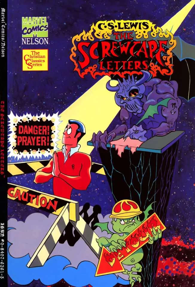
Inks & Calligraphy: Pat Redding
Publisher: Marvel Comics/Thomas Nelson
Publication date: May 1, 1994
ISBN-10: 0840762615
ISBN-13: 978-0840762610
SUMMARY:
Get ready to experience CS Lewis’s classic epistolary novel The Screwtape Letters in an exciting way. From Marvel Comics and Thomas Nelson publishers, the story of Screwtape advising his young “nephew” Wormwood” on how to lead his Patient astray comes to life in a vivid graphic novel.
REVIEW:
What if someone told you that one of the most iconic evil spirits in literature just might exist in the Marvel Comics Universe? And that this figure wasn’t a charmer like Loki or a charismatic figure like Mephisto, but rather an incompetent middle-manager with his own over-inflated sense of self? Moreover, what if someone told you that back in the 1990s this came about thanks to an unlikely partnership between Marvel Comics and faith-based publisher Thomas Nelson, and that this figure wasn’t from the works of Milton, Dante, Marlow, or Goethe, but CS Lewis?
Someone told you right.
Comic historians long noted that during the 1990s, Marvel Comics and DC were struggling in sales, and would do all sorts of publishing gimmicks, such as merging characters into an “Amalgam”, killing them off and replacing them*, putting a popular top tier character on the cover of a book even if they aren’t appearing in the story to guarantee sales, and the classic holo-foil variant cover. One of the more intriguing projects to come about at this time was a partnership between Marvel Comics and Thomas Nelson to publish comic books for the direct market of Christian retailers and comic book stores.
Thi included adaptations of seminal works of literature in the Christian faith such as John Bunyan’s The Pilgrim’s Progress, Charles Sheldon’s In His Steps, CS Lewis’s The Screwtape Letters, while comics legend Louise Simonson (X-Men: Extinction Agenda, The Death of Superman) penned The Life of Christ: The Christmas Story, and The Life of Christ: The Easter Story. There was an even a limited, three issue run of books focusing on an original superhero called The Illuminator. With the exception of The Life of Christ series, these titles were published in the “Prestige Format” these books had the high quality paper and book style bindings as was used for titles like Frank Miller’s The Dark Knight Returns and Alan Moore and Dave Gibbons Watchmen. As a result of this format, the books boasted a pretty hefty price tag ( almost ten bucks for Pilgrim and Screwtape, while The Illuminator books were five bucks a piece in 1990, when a standard comic book was $1.29). Coupled with Thomas Nelson wanting to avoid the having the project to become commercialized with advertisements, and low sales the books sadly isn’t make the impact they could have. Further, in isolating the books primarily to the Christian retail world and not also distributing them to comic book stores, the direct audience that would probably have bought them, just wasn’t there.
It’s a shame too, as the output from the collaboration was actually genuinely good. These did not feel like cheap, cheesy tracts, but honest, sincere attempts to create good, high quality, faith-based graphic novels for younger readers. Further, thanks to a few well-placed Easter Eggs throughout some of the books (Life of Christ withstanding), it was alluded to that they *might* just exist in the mainstream Earth 616 continuity of the Marvel Universe. Some, such as the Illuminator series were more overt in their references, directly acknowledging the events of the then recent Onslaught event in which The Uncanny X-Men, The Avengers, and The Fantastic Four supposedly died**, while others were subtle. The Pilgrim’s Progress was clearly set in modern-day New York City furthering its ties to the Marvel universe at large, and given how often the city is attacked or invaded by Loki, the Skulls, Galactus or Thanos, perhaps the moniker of “City of Destruction” is almost as fitting for the Big Apple as “Gotham City” or “Metropolis” is at their “Distinguished Competition”. Even Screwtape seems to get in on the action as on his shelf exists a copy of the Marvel Universe A-Z, leading at least this long time Marvel fan to think Screwtape suggested to Mephisto at an inter departmental meeting in the underworld the idea of tricking Peter Parker into trading his marriage to Mary Jane Watson for the life of his Aunt May during the infamous One More Day story arc in the Spider-Man books.
But it is this last one, The Screwtape Letters, that you are probably more interested in. At first glance, it doesn’t seem like the kind of book that could make for a graphic novel. Even the celebrated Classics Illustrated series that adapted works of great literature into graphic novels tended to stick to standard novels, short stories, or plays. Screwtape, however, is a series of letters. As a result, unlike Marvel’s The Pilgrims Progress which was more of a literal adaption, complete with modernizing and updating the language and putting the characters in a more modern style of dress then the customary method of drawing them like the Pilgrims at Plymouth Rock, The Screwtape Letters graphic novel literally used the entire text of Lewis’ epistolary novel. However, one of the strong points of this book is that it illuminates some of the moments in the original novel easier to understand for younger readers. For example, a 10-year-old may be confused by the content in Screwtape’s last letter, but in the graphic novel, they see very clearly that the Patient dies during a bombing in World War II and goes to heaven. As a result the key points in each letter are brought to life, allowing the younger reader a chance to grapple with them more on their own terms.
But, the book’s artist, Charles E. Hall, does retain the classic winged gargoyle look associated with demons for Screwtape, Wormwood and the other devils. Wormwood even seems to look not that dissimilar to the imp Pain from Disney’s Hercules, a sightly rotund, inept, bumbling little figure, which makes Screwtape’s rages against him all the more fitting. However for some older fans, it may feel incongruous at times to see the more gargoyle-esque version of these devils juxtaposed with the more elevated language used by the character in the book. At first glance, these evil spirits should almost look closer to Mephisto in the mainline Marvel books, or perhaps even Tom Hiddleston’s Loki. These books were made with younger readers in mind, especially boys between the ages of 10-14, and a more freighting or more subtle appearance for Wormwood might have been more effective. One only need look at Apollyon and the residents of Vanity Fair in Marvel’s adaption of The Pilgrim’s Progress to see that the traditional image of the evil spirits could be menacing and frightening and get he point of the story across, especially for a generation of boys who would go on to come of age with comic books like Spawn, and video games like Doom and Diablo.
However, the designs for the demons to “fit” better with the character designs of the real world. Upon seeing the publisher “Marvel Comics” attached to this, one would be forgiven for expecting The Patient and his Mother to resemble the equally hapless everyman of Peter Parker and his Aunt May, while anticipating that his girlfriend and her father would resemble gorgeous girl next door Gwen Stacy and her father Captain Stacy. Certainly, other Marvel Comics/Nelson books were fond of using a similar “house style” for their art. Thus Andy Prentis, the young teen who became Illuminator boasted a Flock of Seagulls haircut akin to Peter Parker in Marvel’s Spider-Man or Tim Drake in DC’s Batman books, while villain Nick Malloy/Nightfire was like a cross between Ghostrider and Human Torch. Even Christian in their adaptation of The Pilgrims Progress bore a striking resemblance to the character design of Luke Skywalker in Marvel’s line of Star Wars comics from the 70s and 80s, a perfect fit considering like Luke, Christian was in fact an everyman on a spiritual journey of discovery.
That is not the case here, and in fact The Patient, his mother, his girlfriend and the rest of the humans look more like characters seen in the Archie comic books. There’s an innocence and simplicity to them and their world, a sense that the patient isn’t aware of what’s going on beyond the veil of our world and the eternal, and thus the look for the humans conveys that sense. Further, while Peter Parker may be known for his real-world struggles, like holding down a job, his relationship troubles and caring for his aunt, his biggest struggle is between those and saving the world. Few of us would ever have such a choice, whereas the most difficult choices for Archie were between going -out on a date with Betty or Veronica, to put off his homework and hang out at the Chocklit Shop, to get back at Reggie for his latest prank, or any other problem a teen could face.
The Patient is consistently pulled between the desires of the flesh and the spirit, and those desires are ordinary, simple, common place, not the stuff of the cosmic battle of good and evil at first glance. However, through the lens of eternity those small things matter, and that’s what Screwtape is trying to encourage. To that end, making The Patient and his cohorts look like ordinary people, not larger than life heroes is probably more effective. Further, if they had maintained a “house style’ perhaps it would have been too distracting for readers if it “looked” like it was Peter, Aunt May, Gwen and Captain Stacy in the story.
But here’s the rub. Lewis cautions his readers that Screwtape is a liar, and must not be taken literally. The entire story is told from Screwtape’s point of view, and this is how he sees the world. Screwtape, to borrow from the classic villain parlance, feels himself surrounded by morons, and thus Wormwood, Slubgose, and the rest need to look as stupid as Screwtape perceives them to be. If they looked as sinister as we expect, it would be hard to buy Screwtape’s massive superiority complex. Further, despite all of Screwtape’s grandiose talk, Screwtape is a far cry from the foul spirits of Milton, Dante, or Goethe.
Screwtape is at best a midlevel, incompetent bureaucrat, and his power dynamics with Wormwood are less like Sith Lords in Star Wars, and more like the level of sniping we see between Megatron and Starscream in Transformers. Screwtape blames the entire underworld for failing, from Wormwood, to other tempters, to Slubglose at the Tempters Training College, to Infernal Intelligence Department and even the devil himself. Everyone is to blame for losing the Patient, except Screwtape himself, and he fails to realize his advice is terrible, because to do so might cause him to repent.
Even if the implications are true that the graphic novel is set in the Marvel Universe proper, it’s doubtful Screwtape would perceive the heroes of that universe as the legendary figures we see them. To him, the noble selflessness of Steve Rogers, or the sense of moral responsibility of Peter Parker would make them look like a bunch of wide-eyed goody-two shoes like Archie. A woman like Mary Jane Watson, who once got a conceal and carry permit to insure she never ended up like Gwen if Green Goblin came calling, or Peggy Carter who fought literal Nazis would look like a Pollyanna pure heart like Betty Cooper and not like the sort of woman who was not only physically beautiful but strong in faith and spirit and could face lions in a coliseum. This is Screwtape’s world, and the “Patient”, his girlfriend, their families, and Wormwood are just items on his dinner menu.
This is where Hall’s character design for Screwtape really becomes effective. As the story progresses it’s Screwtape whose appearance changes the most as he becomes more menacing until the end, with his face becoming more skull like, as his horns, fangs and claws have grow longer and sharper and spikes protrude from his body. In the last page, Hall renders him not unlike Doomsday from the Superman comic books, a figure bent solely on destruction, and Screwtape’s target for destruction is you, the reader. Further, the graphic novel allows for key moment to actually be seen, and not just when he turns into a giant centipede. Throughout the story strange shapes and forms appear on Screwtape’s body and only learn at the end when we see Wormwood having fully been devoured by his uncle that these were the other failed tempters under Screwtape’s charge. It’s something alluded to happening in the book, but seeing that image at the end in graphic novel’s closing splash panel is not only appropriately jarring and bone chilling, it brings a whole new definition to the words from the demoniac man from Gerasene in the Gospels “We are called ‘Legion’ for we are many.”
Despite being a graphic novel, the letters are no communicated through dialogue bubbles, rather each letter is painstakingly reproduced by the graphic novel’s inker, Pat Redding, using calligraphy to make it appear handwritten. As a result, due to the senior tempter’s erratic personality, and near psychotic rages, Screwtape’s handwriting ends up looking appropriately like the sort of thing the Joker or The Green Goblin would scrawl out to taunt Batman or Spider-Man respectively. As an added bonus when Screwtape transforms into a giant centipede and his secretary takes over, the writing style changes for three paragraphs.
A collaboration between Marvel Comics and CS Lewis doesn’t seem like would be the sort of thing that could exist. Yet in the 1990s the comic book power house crossed the streams with a titan in the Christian publishing industry and took a gambit on what was largely one of Lewis’s best-known stories after Narnia, albeit one that could be tricky to adapt. Some the character designs may seem comical, and occasionally at odds with the story, and the Archie and Jughead style for the Patient’s world may be off putting or more “Serious” fans expecting 90s Marvel/DC/Image Studios art.
However, where it excels is in illustrating key points of the text, bringing to life these memorable moments from the Letters and allowing them to make a more indelible mark on the reader’s imagination. Further Charles E. Hall’s final rendering of iconic Screwtape truly puts the “sin” in “sinister”. Andy Serkis will probably not be reprising his performance as Screwtape from the Focus on the Family Radio play of The Screwtape Letters alongside Robert Downey, Jr.’s Doctor Doom or Sacha Baron Cohen’s Mephisto in Avengers: Doomsday or Secret Wars anytime soon, but for Marvel Comic fans, and Friends of Narnia, this may be one to check it out. Just make sure to read hat final letter with the lights on.
Normally, I include a link here and urge you to buy it on Amazon. However, the book is out of print and is considered a collector’s item with a used copy in good condition going for 95 dollars. On good conscience I can’t tell you to spend that kind of money. Rather I would recommend checking other second hand book stores, eBay, or your local comic book stores back issue bin if you are interested in it.
Four 1/5 out of Five shields.
*They got better.
**Seriously, they got better.

Be the first to comment